Successful Blog

Here is a good place for a call to action.

  • Home
  • Community
  • About
  • Author Guidelines
  • Liz’s Book
  • Stay Tuned

Instant Impressions: 7 Popular Web Design Trends

April 4, 2014 by Rosemary

By Teddy Hunt

The Internet is continuously involving, and people are constantly finding new ways to attract others to their website. Design trends are about as shifty as fashion, so it’s important to keep your website updated with the latest that web design has to offer. With that said, here are seven of the most popular web design trends spicing things up in 2014.

Funky Typography

Funky as in experimental, not funky as in overly complex and unreadable. Graphic designers are having as much fun as ever playing around with fonts and injecting them with flare. These fonts are spicier than your average serif or san-serif like Times New Roman or Helvetica. As the web further expands and more people take to creating their own websites, the need to branch out and come up with unique fonts that stand out is more important than ever before.

Super-Sized Navigation Menus

There’s been a plethora of fancy navigation menus designed, tested, and approved over the past few years, with mobile responsive design (we’ll get to that later) and HTML5/CSS3 influencing that. But the most recent trend seems to involve super-sized menus that expand to huge blocks of content and links. These menus are commonly found on websites that publish great volumes of unique content in high volumes. Although it takes up a lot of space on the page, it provides visitors a broader choice to navigate your website.

Mobile-First Design

The purpose of mobile-first design is to develop your website so that it has a responsive layout that’s accessible by mobile users without sacrificing quality. Essentially, you want to cut of the excess fluff and keep the critical elements. From this perspective, it’s easier to scale up your website’s design to devices that have wider screens. Mobile-first design emphasizes the mobile experience and becomes the foundation for the entire layout. Just make sure that you’re not committing mobile web design mistakes when designing your website.

More Videos

Website visitors are spending less time reading text and more time watching videos and looking at pictures (infographics). With that in mind, it’s time to trash the boring blurbs about what your company can offer and showcase that point in video format (don’t make them too long, though).

Not only is this media format more popular today, but it’s also easily sharable on social media, resulting in more views and greater brand awareness.

Endless Scrolling

Guess what? Scrolling through an in-depth website is easier and faster than clicking through 25 different links to get access to the information you want — and graphic designers are noticing.

These websites aren’t cluttered with content on long scrolling pages, either.

Designers use new website design techniques to format and organize the content in a way that’s easy to read and comprehend. Endless scrolling design can change the layout and design of the page as your scroll further, making you forget you’re scrolling through a lot of information to begin with.

Simple and Subtle Color Schemes

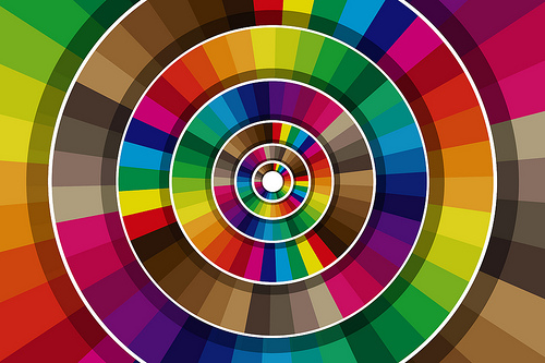
color wheel

The days of eye-popping graphics, complex animations, and crazy color schemes are coming to an end — at least for now. If you’re a smart graphic designer, you’ll use one or two colors instead in the future. One of the more popular trends today is to use a single bright color and a single clean background color like red, teal, or orange (including images or black and white text on top). Not only is this effect minimalistic, but it’s user-friendly.

3D Transition Effects

Whether it’s in animated image galleries, elements, or navigation menus, 3D animations are becoming more popular by the day. You can create 3D effects using jQuery; although, CSS3 has slowly caught up. Unfortunately, not all browsers support these types of animations, so designers avoid using too many on one page. Check out these 3D animated code examples to work from if you want to give a shot.

What website design trends do you expect in the near future? Have you implemented any that make your website stand out better than before? Leave a comment and share your thoughts on the subject.

Author’s Bio: Teddy Hunt is a freelance content writer with a focus on technology. When not behind a computer, Teddy spends the majority of his free time outdoors and resides in Tampa, Florida.

Photo Credit: Viktor Hertz via Compfight cc
Filed Under: Design, Web Design Tagged With: bc, fonts, graphics, web design

5 Type Tweaking Tricks for a Sunday Afternoon

May 27, 2007 by Liz

Tweaking IS Fun, Type Is Meant to Be Read

Blog Tweaks Logo

It’s Sunday. The five minutes of Chicago spring is over. A young blogger’s fancy turns to thoughts of baseball and tweaking a blog. The easiest thing to touch and change in a template is the font size and style. Change a number and whoosh! we’ve got a new look. It’s so easy, that sometimes we do it without attention to how all of those changes work when we put them together.

Our readers live with the result. Sometimes it’s fabulous, sometimes not so much.

5 Type Tweaking Tricks for a Sunday Afternoon

Tweaking type is art of the highest form . . . um . . . or to say it another way, the look of our blog can need some serious tweaking. If we put it together without giving attention to the big picture, or if it’s time to freshen things up to get back in fashion, a few tricks, some perspective will do wonders to move us to a clean, readable, and magnetic result.

Choosing fonts and tweaking them is a form of expression. Taking the time to do it right, previewing as we go is critical, but so is knowing the basics of how people interact with type. Here are some tricks to give special attention to the type fonts on a blogs.

  1. Look out for too many typefaces and type fonts Try to keep to two type families please — three at the most. With a range of sizes, that should be enough to meet all of your type needs. More than that and eyes don’t know where to go or how to focus. Designers know that it’s less distracting to keep the number low — simple is elegant.
  2. In like manner, stick to 3 colors for your type and design. It’s hard enough to find 3 colors that go together well. Colors are more distracting than type fonts. Use a color generator tool to get a palette that defines colors that are made from the same base. If you have a photo in your header some color palette generators will actually pull colors right from it. This will help you avoid colors — red is one, bright blue is another — that can vibrate on dark backgrounds which can motion sickness to occur — seriously.
  3. When working with type, be as makthematical as you can. Make your h1, h2, h3, and h4 (if you use them) heads scale down in equal mathematical increments. The naked eye might be able to tell the difference between 1% em or 1 pixel, but a tension will occur that makes your blog feel slightly out of whack when people look at it.
  4. Define your type area to a readable width. A type area so wide I need to drive to read across and then need to drive back to continue on will wear out my eyes in no time. The width should get narrow as the type gets smaller, so that readers can find their way back to the next line.
  5. Keep your type in blocks. When you lean back and look at your overall blog, your type should hold together in bigger type blocks. For example, the post title, post and all of the after matter should hang as one item, despite the fact that they are many different parts. Adjust the space between the parts until the entire post looks to be a single unit. That will help readers actually see your blog in the way you have written it.

If you spend time today tweaking the type on your blog, these are five points to be vigilant about. Blogs with these problems slow us down as readers. When the reading is slow, we perceive it as work. Soon enough we move on to something that seems more fun.

Great type is like the shine on your shoes. It adds appeal and takes your brand up a notch. It’s a quiet way to let readers know that you care a whole lot about their experience.

–ME :Liz” Strauss
Check out the Work with Liz!! page in the sidebar.

Filed Under: Blog Basics, Design, Successful Blog Tagged With: bc, Blog Basics, blog-tweaks, Design, fonts, type

Recently Updated Posts

How to Become a Better Storyteller

SEO and Content Marketing

How to Use Both Content Marketing and SEO to Amplify Your Blog

9 Practical Work-at-Home Ideas For Moms

How to Monetize Your Hobby

How To Get Paid For Sharing Your Travel Stories

7 reasons why visitors leave websites for ever


From Liz Strauss & GeniusShared Press

  • What IS an SOB?!
  • SOB A-Z Directory
  • Letting Liz Be

© 2025 ME Strauss & GeniusShared