The psychology of colors and design plays a powerful role in shaping how customers perceive brands, make decisions, and ultimately decide whether or not to buy.
In today’s highly competitive digital marketplace, businesses are no longer judged solely by product quality or pricing. Instead, visual communication has become a silent yet persuasive salesperson. Every shade, layout, and visual structure carries psychological weight that influences emotion and behavior in subtle but measurable ways. Understanding this dynamic is essential for brands that want to increase engagement, improve trust, and boost conversions.
This article explores how color psychology and design principles affect customer decision-making and how businesses can strategically apply them to increase sales performance.
How Color Influences Perception and Emotion
Color is often the first thing a customer notices about a brand. Before reading a single word, the brain has already begun interpreting emotional signals based on color choices. This happens within milliseconds, making color one of the most powerful tools in marketing psychology.
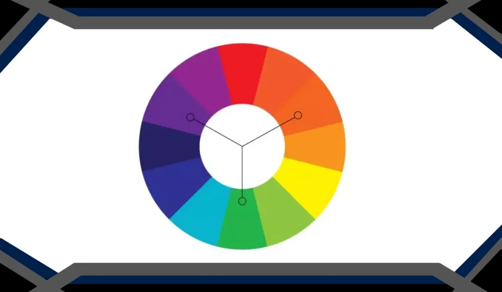
Different colors trigger different psychological responses. For example, blue often communicates trust and reliability, which is why many financial institutions and tech companies use it. Red evokes urgency and excitement, frequently used in clearance sales and fast-food branding. Green is associated with health, nature, and calmness, making it popular in wellness and eco-friendly industries.
However, color perception is not universal. Cultural differences, personal experiences, and context all influence how individuals respond. A color that signals luxury in one region may represent mourning or caution in another. This makes thoughtful application essential.
Some of the most common emotional associations include:
- Warm tones like red, orange, and yellow often stimulate energy, appetite, and urgency.
- Cool tones such as blue, green, and purple tend to evoke calmness, trust, and sophistication.
- Neutral tones like black, white, and gray are frequently used to convey minimalism, elegance, or balance.
Beyond emotional impact, color also improves memory retention. Studies show that consumers are more likely to remember a brand if its color palette is distinctive and consistently applied across platforms. This is why global brands invest heavily in maintaining strict color guidelines across all marketing channels.
The Role of Design Psychology in Customer Decision Making
While color captures attention, design guides behavior. The structure, spacing, and visual hierarchy of a webpage or advertisement directly influence how users interact with content and whether they proceed toward a purchase.
Good design is not just about aesthetics it is about reducing cognitive load. When users encounter cluttered or confusing layouts, they experience friction, which often leads to abandonment. On the other hand, clean and intuitive designs create a seamless experience that encourages exploration and trust.
In the broader context of colors and design, layout psychology works alongside color to shape perception and decision-making. For instance, placing a call-to-action button in a contrasting color increases visibility and click-through rates. Similarly, using whitespace strategically helps guide the eye toward important elements without overwhelming the viewer.
Several psychological principles are commonly applied in effective design strategies:
Visual Hierarchy and Attention Flow
Users naturally scan content in patterns rather than reading everything line by line. Designers use size, contrast, and positioning to guide attention toward the most important elements first, such as headlines, pricing, or call-to-action buttons.
Simplicity and Cognitive Ease
The human brain prefers simplicity. When a website or advertisement is easy to understand, users are more likely to stay longer and engage further. Overly complex layouts can create confusion and reduce conversion rates.
Consistency and Trust Building
Consistent typography, spacing, and visual structure help create familiarity. When users recognize patterns, they feel more comfortable navigating the interface, which increases trust in the brand.
Emotional Reinforcement Through Imagery
Images and visual elements reinforce emotional messaging. A lifestyle image showing people enjoying a product can be more persuasive than text alone, as it helps users imagine themselves in the same scenario.
Together, these principles ensure that design is not just visually appealing but also psychologically optimized for user behavior.
Strategic Application in Branding and Sales Conversion
Businesses that understand visual psychology can apply it strategically to improve branding and sales performance. Every visual decision from logo design to website layout should align with the emotional message the brand wants to communicate.
One of the most effective applications is in branding identity. A strong visual identity ensures that customers instantly recognize a brand across platforms. This includes consistent color palettes, typography, and design elements that reflect the brand’s personality.
For example, luxury brands often use minimalistic designs with monochrome or muted tones to communicate exclusivity. In contrast, entertainment or youth-focused brands may use bold colors and dynamic layouts to evoke excitement and energy.
Another critical area is conversion optimization. Small design adjustments can significantly impact sales performance. Changing button colors, improving spacing, or simplifying checkout flows can reduce friction and increase completion rates.
Key strategies include:
- Using contrasting colors for call-to-action buttons to increase visibility and clicks.
- Designing landing pages with clear focal points to guide user attention.
- Maintaining consistent branding across ads, websites, and social media for stronger recognition.
- Optimizing mobile design to ensure smooth experiences across devices.
Additionally, storytelling through visuals plays a major role in persuasion. Customers are more likely to trust and engage with brands that present a coherent visual story rather than fragmented design elements. When colors and design are aligned with brand messaging, they create a unified emotional experience that strengthens customer loyalty.
Avoiding Common Mistakes in Color and Design Strategy
While design psychology can be powerful, misuse can negatively impact customer perception. Many businesses unintentionally reduce conversions by overcomplicating visuals or using inconsistent branding elements.
One common mistake is using too many colors without a clear hierarchy. This creates visual noise and distracts users from key actions. Another issue is ignoring contrast, which can make text difficult to read and reduce accessibility.
Overloading pages with animations or unnecessary graphics can also slow down performance and frustrate users. In digital environments, speed and clarity are just as important as aesthetics.
A successful approach requires balance. Every design choice should serve a purpose either guiding attention, reinforcing emotion, or simplifying interaction. When visual elements compete for attention instead of working together, the overall effectiveness of the design decreases.
Brands should also regularly test and refine their visual strategies. A/B testing different color schemes, button placements, or layouts can reveal valuable insights into user behavior and preferences.
Conclusion: The Invisible Force Behind Customer Behavior
Color and design are not just artistic choices; they are psychological tools that influence how customers think, feel, and act. When used strategically, they can significantly increase engagement, build trust, and drive conversions.
The relationship between emotion and visuals is deeply rooted in human psychology, and businesses that understand this connection gain a powerful competitive advantage. By applying thoughtful design principles and intentional color strategies, brands can create experiences that resonate with users on both conscious and subconscious levels.
Ultimately, mastering the psychology behind colors and design allows businesses to move beyond decoration and into influence turning visual communication into a powerful driver of sales success.