Successful Blog

  • Home
  • Community
  • About
  • Author Guidelines
  • Liz’s Book
  • Stay Tuned

How to Ace Your Business Website Design

August 7, 2015 by Rosemary Leave a Comment

By Linda Parker

There was a time when people assumed you did not need a website if you were not planning to sell your products online.

But with Internet usage exploding like there is no end to it, every business – big or small, local or international – needs a good website to establish brand presence, maintain customer confidence and boost sales.

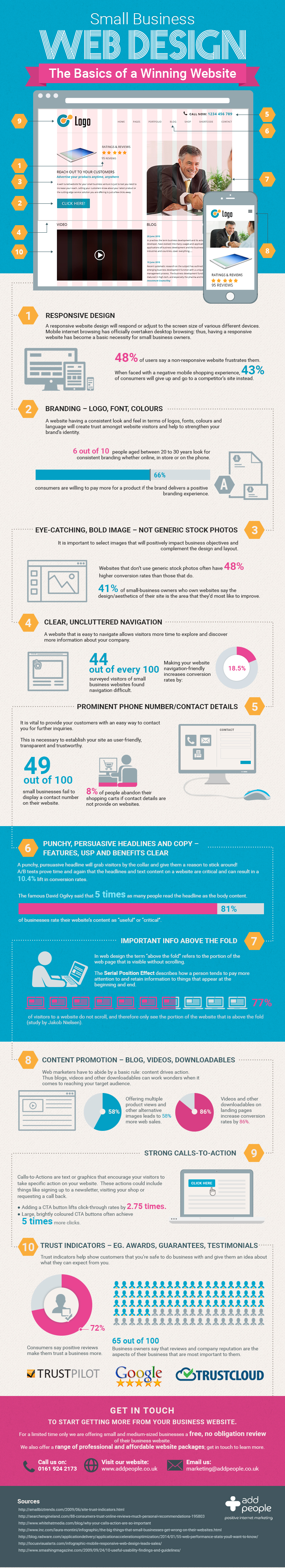
So if you are planning to build a new website for your company from scratch or upgrade your existing one, you can use this handy infographic compiled by AddPeople to get your website design started on the right foot.

infographic - basics of a winning website

Featured image via Flickr Creative Commons: Team Dalog

Filed Under: Web Design Tagged With: website design

3 Point Website Usability Checkup

August 27, 2013 by Rosemary Leave a Comment

By James White

When it comes to Internet marketing, many people get so caught up with how to bring visitors to their site that they forget about what to do with them once they arrive. Since traffic isn’t all that useful unless it can be converted into leads, registered users or customers, you want to ensure that every visitor has the best experience possible.

If you’re interested in improving your site but simply don’t have time to go through the process of a complete redesign and overhaul, the good news is that’s not necessary. Instead, there’s plenty of low-hanging fruit that you can knock out. And even though the changes may not seem huge, they’ll have a significant cumulative impact.

To get a better idea of what usability changes you can handle on your own, here are three options for getting started:

Break Up Content

Having lots of useful content on your site is definitely a good thing. The only problem is if most of that content is in the form of big blocks of text, the majority of your visitors may click away before ever reading any of it.

Luckily, there’s a simple remedy to this common problem. All you need to do is break up your content into shorter paragraphs. Include images or graphics to get your point across. And since usability studies from different sources have all shown that online readers do a lot of scanning, use subheadings so they can get the key points before diving in any farther.

Make Everything Easy to Read

Small font sizes can look cool and sleek. And while you want people to think that your site looks good, it’s even more important that they’re able to read your content. If you’re currently using very small font sizes on your site, strongly consider updating your CSS style sheet to utilize larger fonts that are easier for people of all ages to read.

It’s especially important that all your tabs and links are obvious that they link to another relevant page. Easy to read font also means color consideration. Create attractive contrasts with your text and background but remember not to go too crazy. Lime green or similar bright colored backgrounds will turn people off to your site. Use calming colors that reflect the style of your brand.

Rethink Your Navigation

There’s a chance that your site may already have the perfect navigational structure. If that’s the case, feel free to give yourself a pat on the back. But the reality is most sites have room for improvement. Even if there’s not a major problem, small tweaks can make it easier for your visitors to get where you ultimately want them to end up.

If you’re not sure where to get started with this change, looking for patterns in your Google Analytics data can give you an idea of how visitors are getting around your site and if there are any parts of your navigation that don’t fully address your visitors’ habits.

Another way to decide on navigation is to look at websites you like. For example 12 Palms addiction rehab center has an excellent navigation system that only goes three layers deep and their interlinking is perfect.

If you have the money or talent to go big, Coca Cola’s revamped site is a great example to follow if you are looking to push your content marketing. For more e-commerce sites, check out Empire CAT for how they organize and group their products without having the site cluttered.

You’ll notice in all three examples, there is a simple and clean feel to the design. It also has just a few links on the homepage to help you get started finding what you want. Study your favorite sites and then apply what you learn to your own.

Author’s Bio: James is a freelance writer and founder of InfoBros. In his free time, he enjoys hiking, cooking, and blogging about health, tech and communication. Connect with him on Twitter at @JGtheSavage.

Filed Under: Successful Blog Tagged With: bc, navigation, UI, usability, website design

You Are Not Your Audience

January 7, 2013 by Guest Author 3 Comments

By James Ellis

Right now, go look at your website. In about ten seconds you can probably think of five small things you’d like the site to do better, whether it’s load faster, sort product listings a certain way, maybe even (shudder) that the logo should be a little bigger.

Maybe all those things are going to get done, but maybe they aren’t the right things to focus on. This year, you’ve got a limited amount of resources to manage your site, and you can’t do everything, so you have to make choices. Instead of making choices with your gut based on what you see and what annoys you, maybe you should ask your audience.

I’ve heard the argument that you are enough like your audience that you don’t need to conduct field tests or focus groups or surveys. You don’t need their feedback because you know best on behalf of your audience.

I’m going to set you straight: you are not your audience. It’s not that you can’t understand what your audience wants, it’s the fact that you are a content expert where your audience is not.

Perspective is Important

You are blinded by the curse of knowledge (and yes, maybe this is the first time that someone has said that you are cursed by knowledge, but we’ll let that go). You know, after months and years on the site, where every button is, where every button leads, what every obscurely-named tool is designed to do and who should use it. And that’s the problem: your audience doesn’t have the same knowledge.

You have maybe, MAYBE three seconds to get your brand new user to understand who you are, what you’re here for and a good idea of how to proceed or they bounce. Bounce, the scariest word in any user experience designer’s vocabulary. They came, they saw, they bolted. Sure, some of your audience isn’t looking for what you sell, but without a well-considered home page or entry page that helps frame your story to make it super easy to comprehend, some of your bounces are going to be potential, now lost, customers.

Design for your Customer, Not Yourself

Look, I know you. You’re gonna name every online tool something clever and cute, but something that completely obscured the purpose of the tool because you came up with the name by yourself in a hurry as you were about to push the product out. I’m guessing that’s how Qwikster/Netflix happened.

Or maybe you think that a series of big pretty pictures of food in your restaurant site should push down things like location and hours.

Have you asked your users what they want? What they come to your web site for?

You don’t need to spend hundreds or thousands for a professional focus group or eye-tracking studies. There are plenty of cheap and free ways to collect simple information on what your users want. For example, http://www.4qsurvey.com/ will put a super-simple four-question survey on your site and gets to the heart of the issue, helping you learn what the customer came for and if they were successful in accomplishing that task.

Because their purpose is going to be different from yours. And they aren’t cursed with your knowledge. So embrace this curse and stop trying to think like your audience. Because you are not your audience.

Author’s Bio: James Ellis is a digital strategist, mad scientist, lover, fighter, drummer and blogger living in Chicago. You can reach out to him or just argue with his premise at saltlab.com.

Filed Under: Audience Tagged With: bc, customer design, user experience, website design

Recently Updated Posts

6 Keys to Managing Your Remote Workforce

9 Reasons To Use WordPress

Useful Marketing Tools That Wont Bust Your Budget

Do You Have What It Takes To Be A Successful Blogger?

Do You Have What It Takes To Be A Successful Blogger?

6 Tips for the Serial Side Hustler

How to Make Your Blog Popular


From Liz Strauss & GeniusShared Press

  • What IS an SOB?!
  • SOB A-Z Directory
  • Letting Liz Be

© 2023 ME Strauss & GeniusShared