Successful Blog

  • Home
  • Community
  • About
  • Author Guidelines
  • Liz’s Book
  • Stay Tuned

How to Enhance the Usability of Your E-Commerce Site

July 2, 2013 by Guest Author Leave a Comment

By Charles Mburugu

Usability is a very important factor for the success of any website. When designing your ecommerce site, your aim should not just be to have an online store which looks good on the eye. Instead, work at building a site that makes it easy for customers to find information and complete the checkout process. If visitors have a hard time finding what they are looking for, they will simply leave and go elsewhere.

Here are some tips that will help you make your ecommerce site more user-friendly.

1. Offer contact information

Besides enhancing sales, an ecommerce site can be a very powerful tool for attracting new leads and building new bonds with customers. It is therefore very important to have a dedicated page in your site that contains your contact information. In addition, these details should appear clearly on all your site’s pages. Besides the usual email address, include links to your social media profiles. This will enable visitors to reach you through the medium that suits them best. If possible, you could also offer telephone contacts.

2. Make your navigation clear

Most ecommerce sites have many pages with lots of information about a wide range of products. As a result, visitors are likely to lose their way. This is why a good navigation system is absolutely essential. At any one time, visitors should know exactly where they are, where they have come from and where they can go. A breadcrumb navigation system is very helpful. In addition, make sure your pages have clear headings and subheadings which show the subject of the page.

3. Add a search feature

A native search feature makes it possible for visitors to find what they are looking for without having to go through numerous pages. Make sure the search bar appears prominently on your pages in a place where visitors can easily find it. You could place it on the top of the page or on the right sidebar. Whatever the case, make sure it is ‘above the fold’ (can be viewed without scrolling). To make the search function more effective, you could break it down into filters such as color, size, price, availability and type. This search filter will offer your visitors a more pleasant user experience.

4. Show related products

When designing your product pages, place related products in a common group. When a customer purchases a particular product, you could suggest a different product in the same group. This enhances the likelihood of the customer buying another product, even if they had not planned to.

5. Add a Frequently Asked Questions (FAQ) section

When visitors land on your pages and read the content, they might still be left with a wide range of questions. It is therefore vital to have a dedicated FAQ page on your site which seeks to answer some of the concerns customers are likely to raise. However, allow your customers to contact you in case they need further clarification on anything.

6. Make registration optional

If you require visitors to sign up before accessing your site, they are likely to get put off and simply go away. Therefore, I recommend that you make registration optional. Allow customers to shop even if they are not registered. This will attract more people to your ecommerce site and ultimately enhance customer loyalty.

Author’s Bio: Charles Mburugu is a HubSpot-certified content writer/marketer for B2B, B2C and SaaS companies. He has worked with brands such as GetResponse, Neil Patel, Shopify, 99 Designs, Oberlo, Salesforce and Condor. Check out his portfolio and connect on LinkedIn.

Filed Under: Web Design Tagged With: bc, Design, e-commerce, usability, user experience

You Are Not Your Audience

January 7, 2013 by Guest Author 3 Comments

By James Ellis

Right now, go look at your website. In about ten seconds you can probably think of five small things you’d like the site to do better, whether it’s load faster, sort product listings a certain way, maybe even (shudder) that the logo should be a little bigger.

Maybe all those things are going to get done, but maybe they aren’t the right things to focus on. This year, you’ve got a limited amount of resources to manage your site, and you can’t do everything, so you have to make choices. Instead of making choices with your gut based on what you see and what annoys you, maybe you should ask your audience.

I’ve heard the argument that you are enough like your audience that you don’t need to conduct field tests or focus groups or surveys. You don’t need their feedback because you know best on behalf of your audience.

I’m going to set you straight: you are not your audience. It’s not that you can’t understand what your audience wants, it’s the fact that you are a content expert where your audience is not.

Perspective is Important

You are blinded by the curse of knowledge (and yes, maybe this is the first time that someone has said that you are cursed by knowledge, but we’ll let that go). You know, after months and years on the site, where every button is, where every button leads, what every obscurely-named tool is designed to do and who should use it. And that’s the problem: your audience doesn’t have the same knowledge.

You have maybe, MAYBE three seconds to get your brand new user to understand who you are, what you’re here for and a good idea of how to proceed or they bounce. Bounce, the scariest word in any user experience designer’s vocabulary. They came, they saw, they bolted. Sure, some of your audience isn’t looking for what you sell, but without a well-considered home page or entry page that helps frame your story to make it super easy to comprehend, some of your bounces are going to be potential, now lost, customers.

Design for your Customer, Not Yourself

Look, I know you. You’re gonna name every online tool something clever and cute, but something that completely obscured the purpose of the tool because you came up with the name by yourself in a hurry as you were about to push the product out. I’m guessing that’s how Qwikster/Netflix happened.

Or maybe you think that a series of big pretty pictures of food in your restaurant site should push down things like location and hours.

Have you asked your users what they want? What they come to your web site for?

You don’t need to spend hundreds or thousands for a professional focus group or eye-tracking studies. There are plenty of cheap and free ways to collect simple information on what your users want. For example, http://www.4qsurvey.com/ will put a super-simple four-question survey on your site and gets to the heart of the issue, helping you learn what the customer came for and if they were successful in accomplishing that task.

Because their purpose is going to be different from yours. And they aren’t cursed with your knowledge. So embrace this curse and stop trying to think like your audience. Because you are not your audience.

Author’s Bio: James Ellis is a digital strategist, mad scientist, lover, fighter, drummer and blogger living in Chicago. You can reach out to him or just argue with his premise at saltlab.com.

Filed Under: Audience Tagged With: bc, customer design, user experience, website design

Technology shouldn’t torture people

December 2, 2010 by patty Leave a Comment

by Patty Azzarello

cooltext466496263_leadership

Really?

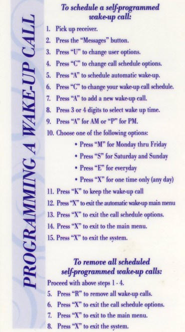
I was traveling in Cincinnati recently, and was greeted with the following in my hotel room. I was staggered.

I removed the actual hotel name, but this was real.

Is it just me, or are these 19 steps to program a wake-up call a bit much?

wake-up-call

Technology and Humans

I built a successful career in technology by following one guiding principle:

Make the technology less painful for humans to use.

Focus as much (if not more) energy on the human interface as on the technology itself.
Don’t ever show of the richness of your technology in the user interface. 

Focus completely on the user’s task. Understand how people are thinking about the task they need to do, and help them do it the way they are inclined to do it.

The point is never to show that your technology is smart and powerful, it’s to make your user feel smart and powerful.

Patty’s 3 Laws of Technology

(Break them at your own business peril.)

1. Technology should not rob people of their humanity
2. If you present technology instead of a human interface it HAS TO WORK
3. Technology should never make people feel stupid

Here is what I mean:

1. Technology should not rob people or their humanity.

Probably the best example of this are those voice automated systems that make you talk to a computer on the other end of the phone.   I don’t know about you, but I hate this. I would feel much less robbed of my humanity if I was greeted with a computer voice that said…

I know I’m not a person like you are, and that you’d rather talk to a person, but we think we can help you faster if you are willing to give this a try. We won’t make you talk to a computer and pretend it’s a person, and feel like an idiot shouting answers and phrases repeatedly because we can’t actually understand them… Please help us route your call by keying in your account number and answering ONE question – then you’ll be connected to a real person.

Any time your user interface makes a person translate something they are thinking or feeling into a narrow input that your technology will accept, you have robbed them of some humanity.

2. If you present technology instead of a human interface it HAS TO WORK

If you want me to sign up for your service on your website, don’t require a special new version of a flash plug in for me to do it.  Don’t invite me to leave you feedback, only to have a link that doesn’t go anywhere.  Don’t optimize your interface so much for one platform or environment that it doesn’t work right in others.

When something goes wrong…

A human can recover and use creativity and judgment (and opposable thumbs)  if the transaction does not work. Technology just sits there there not working, and the user goes away having failed to complete the task.

I was duped recently at the airport when I accepted a boarding pass sent to my mobile phone and got to an airport that didn’t have the ability to read it.

I was promised I could pick up a prescription after hours, from an automated pharmacy dispenser, and they had mis-spelled my name when they input the prescription so there was no way I could pick it up and no way for the machine to recover.  There was a phone support number on the machine connecting me to a line which was un-manned after hours.

Make it fool proof
Test everything.  One of the best software tests  I ever saw was a CEO who sat on the keyboard.  The system broke.  Test your technology in ways users are not supposed to use it, because they will always do things they are not supposed to do.

Use Standard (boring) components
Go out of your way to use technology components that are as standard and hard to break as possible.

Don’t try to make your screens extra-pretty, or use bleeding edge widgets and gadgets in your user interface because they amuse you, you are trying to be impressive, or you want to try something new — especially if if there is to be no-human back up when it doesn’t work.

Set your standard to “It has to work”.  Not “It has to be leading edge”.

Don’t lose customers
If you replace humans with technology, if it doesn’t work you will lose customers because you have given them no possible alternative but to go away. There is a corollary to this law which is “Don’t make people work hard to give you their money”.

3. Technology should never make people feel stupid

This issues is starting to go away as technology is actually working better and young people are immune to thinking that it is their fault if it doesn’t work.

Complexity is the enemy
But when technology is unnecessarily complicated and hard to use, it makes (us old) people feel inadequate because we can’t accomplish the task at hand.

I don’t think I have ever got through a self-checkout lane without requiring assistance from a clerk and feeling a bit stupid.

If you buy wine, someone still needs to check your ID. You Fail.
If you by an item that is too large to put in the bag, the system will freeze because it can’t sense that you put it in the bag after you scan it. You fail.
If you buy organic produce, it doesn’t have a selection for organic. You Fail.

At this point you are given the choice either to wait for help (you feel stupid) or to steal money from the store because you can’t find a way to pay the organic up-charge (robbed of your humanity, and being made to work too hard to give them your money).

The good, at least mitigating, news is that most self-checkouts follow rule number 2.  It HAS to work – so they put human backup there.

Making technology better for humans is good for business.

Apple is an obvious example. But even putting Apple aside as an outlier, I can tell you that in every business where I had responsibility to bring technology products to market, focusing on the human interface was good for business.

We put extra effort on the user’s thinking process, the user interface, the install, the demo, the “start here” experience, the documentation, the customer support help desk, and the sales and contracting documents and processes.

By doing this, my businesses were able to steal share from competitors who were overly focused on the features of their technology alone, and tortured their customers and partners because of it.

What do you think?

Has technology ever tortured you? Do you think it helps business to make technology easier to deal with? There’s a comment box below, what’s your view?

—–
Patty Azzarello works with executives where leadership and business challenges meet. She has held leadership roles in General Management, Marketing, Software Product Development and Sales, and has been successful in running large and small businesses. She writes at Patty Azzarello’s Business Leadership Blog. You’ll find her on Twitter as @PattyAzzarello

Successful-Blog is proud affiliate of

third-tribe-marketing

Filed Under: management Tagged With: bc, LinkedIn, Patty Azzarello, user experience

Four Human Reasons People Participate and Keep Coming Back

February 11, 2010 by Liz 5 Comments

It’s about Me!

cooltext443809602_strategy

When new clients start talking social media, it’s not long before they get to “engagement.” They want to know what moves crowds and individuals to genuine participation. What attracts us? What connects us? What keep us coming back and bringing our friends with us?

What makes one space more fun to participate in than another that looks like the same thing?

Why we participate might vary with each participant, but participants all have things in common — simple human reasons that give experiences meaning.

  • Fame — some folks come for recognition. When we participate, our words get seen and read. Sometimes they’re shared. Every blog post, tweet, status update, and comment aggregates to form our reputation. And now that we friend and follow others, we have even more direct channels to share our words of wisdom and attract a following.

    Will your online experience attract the group you want — the authorities, the elite, or the “Internet famous?”

  • Fortune — some folks come for contests and giveaways, but leave when the prizes quit coming. Some folks are interested in information or training that will raise their income. It’s a tricky business to combine participation and money without it beginning to feel like I’m working for it.

    Will your online experience offer enough to keep folks coming back?

  • Friendship — connections on the social web are clicked on and off in seconds. So the key is conversation between people with common ideas or values. Conversations between like-minded friends grow exponentially faster than their real-world counterparts. Without barriers of time and space, meeting is simpler and more convenient. I leave a message you respond later.

    Will your online experience make it easy for folks to talk to people like themselves about things that they care about?

  • Fun — the distraction of new people and new ideas. The level playing field in which introverts and extroverts both have to type makes it fun. Spice it up with some game that brings out personality … keep it simple and easy. It’s endless conversation in a coffeehouse that’s always open.

    Will your online experience be fun for folks who want to be with other people?

When we’re looking at an online experience, we have to consider what the human payoff is. What is the most basic reason that people will come and come back? That reason will underscore and validate that the environment we’re building is right for the ones we want to come to share it. Incorporate the values of the folks you want to be there, and people will participate and keep coming back.

Seems simple doesn’t iit? Humans will be human.

Which reason do you think attracts most folks to participate on Twitter?

–ME “Liz” Strauss
Work with Liz on your business!!

Buy the ebook. Learn the art of online conversation.

Register Now!! for sobcon-vmc

Filed Under: Community, Marketing /Sales / Social Media, Successful Blog Tagged With: bc, LinkedIn, participation, Twitter, user experience

Recently Updated Posts

6 Keys to Managing Your Remote Workforce

9 Reasons To Use WordPress

Useful Marketing Tools That Wont Bust Your Budget

Do You Have What It Takes To Be A Successful Blogger?

Do You Have What It Takes To Be A Successful Blogger?

6 Tips for the Serial Side Hustler

How to Make Your Blog Popular


From Liz Strauss & GeniusShared Press

  • What IS an SOB?!
  • SOB A-Z Directory
  • Letting Liz Be

© 2023 ME Strauss & GeniusShared