Successful Blog

  • Home
  • Community
  • About
  • Author Guidelines
  • Liz’s Book
  • Stay Tuned

Get a Grip on Visual Content

April 8, 2014 by Rosemary Leave a Comment

By Lisa D. Jenkins

The saying, “A picture is worth a thousand words” is cliche for a reason.

It’s no secret that images receive more engagement on Facebook than their text only counterparts. The growth of audiences on Pinterest and Instagram, even Tumblr, supports the notion that at our core, we humans are a visual bunch.

And now there’s a whole lot of talk going around about visual content and its rapidly increasing influence online.

So, what exactly is this visual content all the cool kids are talking about? Let’s agree to set jargon aside and not make this harder than it has to be. We’re talking about images; photos, videos and graphics. Visual content uses all types of imagery to communicate and support your messaging clearly and quickly. As a delivery medium, visual content is perfectly suited to social media because it’s easily consumed and shared.

Lowe’s uses Vine shorts like this one to give helpful life hacks to their customers who then share the hack and extend Lowe’s reach and visibility.

From video to photos and infographics to animated GIFs, marketers are using visual content to their advantage in pursuit of goals such as establishing market authority, gaining share of voice, driving higher CTR’s and contributing to the bottom line.

One of the most attractive things about adding visual content into your online, digital and/or social marketing strategies is that you can include not only brand generated content but user generated content as well. With some forethought, your content creators get a break, and your fans get a nod from a brand they’re passionate about.

This collection of #sharelove images from Starbucks fans generated over 26k Likes, 200 Comments and 600 Shares – that’s a lot of news feed visibility, and we all know how hard that is to come by these days.
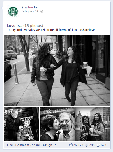
Starbucks visuals

If you want to learn more about what’s out there and how you can apply it to your own marketing activities, come back here every other Tuesday. I’ll share some examples of visual content from brands, give you some ideas for implementation and execution, and throw in a helpful tool or two to get you started.

What do you most want to learn?

For today, I’m just going to say thanks for dropping in and leave you with this infographic from On.com that explains how we got here.

The Growth of the Visual Web - On.com
Author’s Bio: Lisa D. Jenkins is a Public Relations professional specializing in Social and Digital Communications for businesses. She has over a decade of experience and work most often with destination organizations or businesses in the travel and tourism industry in the Pacific Northwest. Connect with her on Google+

Filed Under: Content, Design Basics, Successful Blog Tagged With: bc, Design, images, visuals

6 Design Principles Every Blogger Should Be Familiar With

February 28, 2014 by Rosemary Leave a Comment

By Teddy Hunt

As a successful blogger, you’re probably acutely aware that the best bloggers are the best content creators. But even the most top-notch content needs a reliable platform to capture its readers’ attention and make it in the blogosphere. Alas, most people do in fact judge books by their cover.

Here are a few key design principles that’ll help persuade your readers to open the book and enjoy your content.

The Fundamentals

No matter what medium you’re working with, the fundamental elements of design are the same:

• Hierarchy

• Contrast

• Repetition

• Shape

• Texture

Surely there are differentiations between print and digital media, but generally speaking, these principles make up the backbone of successful design. Careful implementation of each of these principles will ensure a well-received finished product.

Hierarchy

The design principle of hierarchy refers to the order in which information is processed by viewers. When it’s implemented effectively online, viewers can quickly scan a webpage to get an idea of what content they find interesting and what content they can disregard. When the hierarchy of a website is off, it seems jumbled; users are forced to look deeper into the site to find relevant content. When viewers can’t immediately recognize what they’re looking for, they’re more likely to click away. Subsequently, this trend will hurt your SEO rankings and cut down on the overall traffic to your site.

People generally follow a top-to-bottom, left-to-right eye path when they view websites; keep this in mind as you design your webpage.

Color/Contrast

Of course, contrast is the visible difference between elements. It can refer to color, texture, shape, style, and several other factors. A healthy dose of contrast can give a website the perfect mix of variety and interest. It’s helpful for drawing attention to specific aspects of your work. It can make certain design elements pop or fade into the background, depending on how you use them. Be mindful of your use of contrast as you critique your website and avoid having too much or too little differentiation in your color scheme.

Repetition

Much like contrast, repetition can refer to a variety of elements, including shape, size, color, and texture. It adds a sense of regularity to a design, enhancing the overall flow of the page. As with any design element, too much texture can be jarring or –worse — predictable. You can utilize repetition with similarly shaped objects and fonts. The repeated designs don’t have to be identical either; sometimes illustrations with similar qualities will suffice.

Possibly one of the most versatile design principles, shape actually applies to every other principle evenly. That is, everything is a shape. When it’s applied to web design, it’s important to keep in mind the overall tone you’re striving for, creating shapes that go together with an equal balance of contrast and repetition as well.

Texture is the surface perception of shape. It can be rough, smooth, soft, hard, glossy, or matte. But it’s much more than that. When it’s used well, texture gives any design, on any platform, that “finished” look. It’s easier to describe texture in a three-dimensional design: the feel of a canvas through paint thickness or the surface of a sculpture through carving techniques.

In visual designs, such as websites, texture is suggested and not felt.

Web designers can achieve visual textures through simulating the visible attributes of real-life textures by implementing shading and shadows, as well as mimicking the coloring of real objects. Often it’s achieved through the repetition of lines, marks, and strategically placed spacing. Bring texture into your website’s design and you’ll up the “wow” factor instrumentally.

As you can see, there’s a very thin veil between web design and traditional design. While certain key changes have to be made to accommodate digital platforms, everything that’s important for traditional designers is also key for web designers. Every blogger should be aware of these principles and use them on their sites.

Do you have any tips or tricks for using these design principles on your blog? Please feel free to share with us in the comments.

Author’s Bio: Teddy Hunt is a freelance content writer with a focus on technology. When not behind a computer, Teddy spends the majority of his free time outdoors and resides in Tampa, Florida.

Filed Under: Design Basics Tagged With: bc, Design

Leaving Your Mark: 7 Popular Logo Design Trends

February 14, 2014 by Rosemary 1 Comment

By Teddy Hunt

A logo is one of the most powerful weapons you have when it comes to annihilating your competition and standing alone as the most powerful company in your industry. Conversely, having a poorly designed logo is the equivalent to shooting yourself in the foot. When creating your company’s logo, make sure that it’s something that positively stands out and attracts potential customers and clients in the blink of an eye. 

With that said, here are seven popular logo design trends that you should consider using if you haven’t already. 

1. Purposeful Negative Space

FedEx logo design

Image via Flickr by adactio

Negative space, also known as white space, is essentially space that doesn’t include content (it doesn’t have to be white — it can be any color as long as it doesn’t have content). The purpose of negative spacing in logo design is to draw attention to a specific object without having their eyes wander all over the place. Combining design and negative space in a clever way is also effective. The FedEx logo is one of the best when it comes to using clever design and negative space (take a look between the “E” and “x”). 

2. Dynamic Letterpress Techniques

 
This is one of the newer techniques used by logo designers, adding depth to objects within the design. The technique essentially elaborates on original letterpress design, providing a new look that’s appealing to the eye. Letterpress was originally done in print, but graphic designers are now using computers to recreate their own unique styles of this technique. If you want to follow the newest trend out there, this is the one. 

3. Line Art

Line art is an image that has distinct straight and curved lines placed against a plain background, without changes in shade or hue to represent either two or three-dimensional objects. Graphics designers usually use a pen tool in Illustrator to create a clean and thin-shaped logo using this type of art. Here are some great examples of line art used in logos. 

4. Gradient Mesh Adds Depth

It’s said that gradient mesh is one of the most powerful tools in a graphic designer’s Illustrator toolbox, but it isn’t easy to master the skill of using it. One of the biggest benefits of being able to use this tool effectively is that it helps you provide depth to a logo in ways that other tools can’t, enabling your to recreate shadows and highlights that give your logo a unique perspective. Here’s a beginner’s tutorial on how to use the gradient mesh tool.

5. Contrast With Dual Impact

Simply put, graphic designers use the dual impact technique to create a double impression in a logo. If you look at this dual impact logo example, you’ll notice an outline of a buck within an elephant. This dual impact design provides a clean and clever logo that’s perfect for a wildlife zoo. 

6. Geometric Abstract Polygon Styles

One of the most popular and common technique in logo design in 2014 involve geometric abstract polygon styles. Although the name of the technique sounds complicated, it simply refers to making different abstract shapes stand out within one or multiple areas of the logo. If you’ll still not picturing clearly in your head, take a look at this logo example that highlights the concept and technique. 

7. The Overlap Technique 

The overlap technique in logo design has been around for ages, but it’s especially becoming popular this year. Graphic designers using this technique allow different elements of a logo to overlap one another, making it possible to add depth to it in a way that makes it interesting but not distracting. eBay’s logo is a great example of overlapping typography to create a unique look, making it a logo design that’s effective. 

It’s more important than ever to have a logo that stands out and says that your company matters in the world. Applying the right technique and design can make all the difference. 

What new logo designs have you noticed that are stellar? Leave a comment below and let us know. 

Author’s Bio: Teddy Hunt is a freelance content writer with a focus on technology. When not behind a computer, Teddy spends the majority of his free time outdoors and resides in Tampa, Florida.

Filed Under: Design Basics Tagged With: bc, Design, personal-branding

6 Mobile Web Design Blunders to Avoid

January 14, 2014 by Rosemary Leave a Comment

By Charles Mburugu

In recent years, people have increasingly shifted from using computers to accessing the internet from their mobile devices. Therefore it’s essential for every blogger, webmaster and business owner to have a mobile-friendly website.

Here are some of the major blunders you need to avoid when designing your mobile site.

1. Failing to optimize images

Images are a very important element for any mobile website design. However, using images or elements that have large file sizes will significantly slow down the loading speed of your pages. When your pages take too long to load, visitors will simply click away and go elsewhere. This is why it is very important to optimize the images on your site. Preferably, only use images and elements which are small in size.

2. Not considering screen sizes

Compared to desktop and laptop monitors, the screens of mobile devices are relatively small. Therefore, when designing your mobile site, you need to take into account screen width and size. Your design should be able to fit well in different screen sizes with all page elements displaying correctly. Make sure your buttons and icons are large enough for users to tap with their finger. Don’t forget to have enough space between your links and buttons.

3. Excess content

Content is what drives visitors to your site and keeps them coming back. Make sure your content is arranged in a way which is pleasant to the eye and easy to read. Avoid having excessively lengthy posts on your mobile site. If you would like to share a lot of information, you could break it down into short sections with a ‘read more’ link at the end of each section. Make sure the text is spaced out and large enough for mobile users to read without straining their eyes. In addition, use a background color which contrasts sufficiently with your text.

4. Not having collapsible navigation

Most mobile users are very impatient people who access the internet while on the go. Therefore, your mobile site should be designed in a way that allows visitors to find what they are looking for as fast as possible. One of the best ways of presenting content on your site is through using collapsible categories. This allows you to keep the pages of your site clean and neat, thus ensuring that visitors can find information on your site easily.

5. Having long input forms

Typing on the keyboard of a smartphone is not as easy as typing on a computer keyboard. With this consideration, it would be advisable to keep the forms on your mobile site as short as possible. Users should only be required to complete the few fields that are critical. Alternatively, you could consider providing a multiple choice option with check boxes, radio buttons or combo boxes. This will save your visitors the trouble of having to type their entries.

6. Not testing your design

Once your design is complete, you need to test it using different kinds of mobile devices. This will enable you to identify any concerns with regard to your site’s feel, content and usability. You can also get useful feedback by sharing the design with your friends and business associates. Take time to tweak your site until it works well on as many mobile devices as possible.

Author’s Bio: Charles Mburugu is a HubSpot-certified content writer/marketer for B2B, B2C and SaaS companies. He has worked with brands such as GetResponse, Neil Patel, Shopify, 99 Designs, Oberlo, Salesforce and Condor. Check out his portfolio and connect on LinkedIn.

Filed Under: Design Basics Tagged With: bc, Design, interface, mobile

Photography Secrets for Bloggers

January 9, 2014 by Rosemary 1 Comment

You’re already aware of the shift toward image-centric content, and I’m sure you’ve already started amping up the graphics in your blog posts, right?

The latest development is that even the Creative Commons licensed and free photography you’ve been using is not 100% reliable.

The safest thing to do by far is to take your own photographs. (Professional photographers, please stop reading here…)

Chances are, you’re carrying around a pretty decent camera already, inside your smartphone. If you invest a little bit of time in learning some composition and editing skills, you can stop worrying about stock photos and image licenses forever. And you have unique photos on your site to boot! You may even find a new hobby, and decide to purchase a standalone camera to take it to the next level.

photography for bloggers

Top Photography Secrets for Bloggers

  • Keep a visual mindset all the time. See that coil of rope? Could it illustrate a post about pathways? How about those birds lined up on the shore? Make it a habit to look around you for imagery wherever you go.
  • Horizontal is good for blog posts. Don’t just reflexively hold your phone vertically all the time. Horizontal orientation works better most of the time for blogs, and for sliders and other graphics as well.
  • Go as high resolution as you can. You’ll be glad later when you want to zoom in to a specific part of the picture.
  • Use online editing tools like Picmonkey to make nice text overlays for social sharing or to add your site URL or copyright.
  • Take a TON of photos. Think about the pros and how their shutters are snapping a hundred times during a photo session. If you want to capture that one great picture, take 10x the snaps.
  • Make a spot to organize them (Evernote, digital albums, Dropbox folders). Create a dedicated place to upload your blog photos after you take them, and name them with descriptive names that will make them easy to pull into the right posts. Consider organizing into categories like Nature, Office, Architecture, or whatever suits your niche.
  • Keep a backup. Be sure you keep a backup of your photo files, and don’t rely on your computer/laptop. Use the free services that are available, like Google Drive or Dropbox to keep them secure.
  • Think micro. For casual photography, we often look at the big picture, or the family group, or the huge vista. For blog posts, you might want to think about the way a shadow hits the sidewalk, or the ladybug sitting on a leaf. Get small.
  • Consider buying some pro tools. To get the lighting perfect on small objects, you can buy inexpensive, portable studios like a Modahaus. There are also inexpensive lighting kits like the Kick.
  • Pay attention to tips from the pros, like these excellent photo ideas from National Geographic, or these great composition tips from Digital Photography School.

Have you tried your hand at digital photography? As a blogger, it can be a very useful skill-set!

Author’s Bio: Rosemary O’Neill is an insightful spirit who works for social strata — a top ten company to work for on the Internet . Check out the Social Strata blog. You can find Rosemary on Google+ and on Twitter as @rhogroupee

Filed Under: Design Basics Tagged With: bc, blogging, copyright, images, photography

Guidelines for WordPress Security

December 17, 2013 by Rosemary 4 Comments

By Charles Mburugu

With the increase of hacking incidences, security has become a major concern for most website owners. Fortunately, there are several precautions one can take to lower the risk of attack. Here are some tips which will help enhance the security of your WordPress site.

1. Avoid free themes

WordPress offers numerous free themes that you can choose from. However, using such themes is generally not advisable since many have been found to contain malicious code which would make your site vulnerable to all kinds of attacks. If you must use a free theme, make sure you select one which has been developed by a well-established company. This also applies to WordPress plugins.

2. Choose a secure host

Web hosting plays a major role when it comes to security matters. Therefore, when selecting a web host, don’t make the mistake of settling for the cheapest option available. Instead, take time to do your research and identify a provider that is well known for secure hosting. Though it might cost you a little extra, you won’t have to worry about your website’s security.

3. Update regularly

In an effort to enhance security, WordPress releases regular updates which are aimed at dealing with potential or real threats. Therefore, it is very important to keep your site updated with the latest WordPress version. Failing to do so will leave your site vulnerable to hackers who target outdated WordPress versions. Always be on the look-out for ‘Update now’ messages on your dashboard. Plug-ins and themes should also be updated immediately a new version is released.

4. Use a strong password

Using a weak and predictable password such as ‘123abc’, ‘wordpress’ or ‘password’ will make your WordPress site more vulnerable to attack. Therefore, you need to find a more complex password, but one which is easy to remember. Combine symbols, numbers and letters to make it harder to crack. However, avoid using the same password across different accounts.

5. Don’t use the default ‘admin’ username

Many people have ‘admin’ as the default username on their WordPress sites. Having such a username, combined with a weak password, will expose your site to all kinds of security risks. It is therefore very important to alter your username to something which is more unique. In addition, you need to ensure that the username is hidden from author archive URL.

6. Limit login attempts

Hackers and bots try to access your site by making repeated login attempts using different variations of usernames and passwords. WordPress offers great plugins which can help you limit the number of login attempts on your site. In addition, you can choose how long the specific IP address will be locked out before they can make another attempt.

7. Use security plugins

WordPress offers a wide range of plugins which can help enhance the security of your site. Some of the most popular include Bulletproof Security, Better WP Security, Wordfence, Sucuri Scanner and Website Defender. Most of these plugins are free and can easily be downloaded and installed on a site.

8. Backup frequently

Backing up frequently is something that should not be overlooked. Even when you have taken all the above security measures, your site might still fall victim to a malicious attack. If your content is backed up properly, it will be easy to recover your files and restore your site. There are several WordPress plugins which can help you schedule frequent automatic backups.

Author’s Bio: Charles Mburugu is a HubSpot-certified content writer/marketer for B2B, B2C and SaaS companies. He has worked with brands such as GetResponse, Neil Patel, Shopify, 99 Designs, Oberlo, Salesforce and Condor. Check out his portfolio and connect on LinkedIn.

Filed Under: Design Basics Tagged With: bc, hackers, security, WordPress

  • 1
  • 2
  • Next Page »

Recently Updated Posts

9 Reasons To Use WordPress

Useful Marketing Tools That Wont Bust Your Budget

Do You Have What It Takes To Be A Successful Blogger?

Do You Have What It Takes To Be A Successful Blogger?

6 Tips for the Serial Side Hustler

How to Make Your Blog Popular

Helpful Tips for Business Blogging


From Liz Strauss & GeniusShared Press

  • What IS an SOB?!
  • SOB A-Z Directory
  • Letting Liz Be

© 2023 ME Strauss & GeniusShared