Successful Blog

  • Home
  • Community
  • About
  • Author Guidelines
  • Liz’s Book
  • Stay Tuned

How Design Affects Productivity in a Coworking Space

February 28, 2019 by Guest Author 1 Comment

By Kayla Matthews

With control and flexibility in their jobs, freelancers and remote employees determine where they work. Many choose to join coworking spaces to carry out their work hours. A variety of professionals join these membership-driven communal workspaces to get out of the house or bounce ideas off other creatives.

While there are plenty of reasons to frequent a coworking space, the benefits of a diverse work area unite independent workers. After joining a coworking space, 74 percent of workers had an increase in productivity, making many people appreciate these communal areas.

With the proper design, professionals can thrive in these settings. A substantial factor in productivity involves a positive surrounding. Well-designed environments attract occupants, and the perks of the layout, furnishings and decor can help professionals stay on task. Here’s how design in coworking areas changes focus and efficiency.

Balances Distinct Productivity Styles in the Layout

Coworking spaces prioritize creativity and collaboration in primarily open office layouts, but with an assortment of people, some prefer less chatter to function at their best. Open office layouts can create high levels of stress or a lack of motivation for some, which hampers productivity. Coworking spaces that cater to both personality types help all professionals function at high levels.

Since concentration is a key part of productivity, coworking spaces are designed with the verbal and internal processors in mind. Open floor plans attract and increase productivity for interactive people and groups, while quiet zones and private alcoves allow space for others to work on their own. Members of coworking spaces are encouraged to respect designated talking and quiet spaces to help their fellow co-workers remain focused and on task.

Gives an Impression of Identity and Belonging

Individual workers who don’t have a set office may find community in vibrant, contemporary coworking spaces. They also often feel less isolated and can find belonging and recognition. Coworking spaces are more conducive for collaboration and networking, too. These components help to increase work performance and satisfaction.

Although there isn’t a set “company culture” in a coworking space, the decor can still connect workers to an overall purpose. Decorations like large-scale murals can instill enthusiasm and identity in independent workers. Adding graphics and artwork can enliven a workspace and make it a pleasant context to complete tasks in.

Boosts Moods With Visual Accents

Although it seems like a subtle aspect of design, sufficient lighting can transform a place for workers. Natural light can elevate your workplace performance because of the connection between daylight exposure at work and overall quality of life. When asked about elements of an effective workplace, over 75 percent of 250,000 employees said they feel natural light is important.

Adding more windows to the design place can help co-working spaces give independent professionals a productive edge during the workday. Thrive Workplace, a coworking community in Denver, includes natural light in their facility to cultivate a vibrant atmosphere. Greenery and office plants also help to brighten and invigorate communal work areas.

Offers a Sense of Flexibility

Certain types of stress during work can be detrimental to productivity. When you start producing low-quality work, the pressure can keep you from operating at full capacity. However, workplaces with informal breakout rooms and relaxing stations provide a chance to regroup and give your mind a break.

The right setup can amplify the freedom of independent work with additional opportunities to de-stress. Fun, versatile areas in a coworking space can diminish the burden of work, as long as they don’t impede on zones reserved for formal meetings and serious tasks. Separating the main working section from places to unwind can produce flexibility.

Incorporate Helpful Design Elements

An appealing design can set apart a coworking space and lead to further productivity for occupants. Decor, layout and accents can all form a beneficial setting that suits a diverse group of professionals. Complement the best components of communal work areas with an engaging design.

Do you use a coworking space? What would you say are the pros and cons?


About the Author: Kayla Matthews writes about communication and workplace productivity on her blog, Productivity Theory. Her work has also appeared on Talent Culture, MakeUseOf, The Muse and Fast Company.


Featured image: Photo by Al ghazali on Unsplash

Filed Under: Productivity Tagged With: coworking, Design, Productivity

Book Review, X: The Experience When Business Meets Design

April 14, 2016 by Rosemary Leave a Comment

Brian Solis is an award-winning author, blogger/writer, and futurist. His experience as principal analyst at the Altimeter Group research firm gave him wide ranging access to data, innovative technology, and business strategies that help companies connect with their customers.

His latest book, X: The Experience When Business Meets Design, makes the case that we need to move beyond just great products, creative marketing, and delightful customer experience.

We need to create meaningful experiences.

The book itself is an experience for the reader. It was designed with the intention of being surprising, engaging, and meaningful itself. The shape, the fonts, and the “chapter design,” all give the reader permission to create his/her own journey through the content.

the real customer journey

Meaningful experiences don’t happen by accident

My favorite summer job was when I worked as a tour narrator in Washington, DC. The training was intense; we went through two weeks of learning every detail contained in a 3-inch thick binder of material.

Each morning we’d be tested on the previous nights’ assignment. We had to pass the fact memorization part of the training before we could get on the tram microphone.

The magical part of the process? There was no script.

Once we memorized all of the facts, we were responsible for weaving them into an educational, entertaining narrative for our audience of tourists on the tram. That meant that every time someone hopped on a tram, they would be getting a fresh experience, based on the specific tour narrator at that moment.

It was a complete rush for me, designing that experience on the fly, every time the tram left the station.

“Shared experiences have become a critical part of marketing.” -Brian Solis

How to create meaningful experiences for your customers

  1. Map your customer journeys. You need to know what they are currently experiencing before you can offer a new perspective.
  2. Align your organization. To deliver experiences that resonate, you’ll need to get the whole team on board. Marketing, sales, developers, everyone.
  3. Create a plan. Decide how you will create an “experience layer” along the entire customer journey. Be sure to avoid any disconnects between pre-sale and post-sale experience.
  4. Listen. The experience process isn’t static. Pay attention to the signals your customers send out along the way, to find areas where you can improve the experience.

I’d recommend this book to anyone who wants to build a business that can survive and thrive into the future, as the power shifts from brand to consumer. It’s a deep dive, but very approachable. It makes a good reference book, since you can quickly pop into the structure at any point. There is also an interactive experience online to reinforce the messages.

Does your business strategy include the experience factor? What types of experiences could you provide for your customers?

Author’s Bio: Rosemary O’Neill is an insightful spirit who works for Social Strata — makers of the Hoop.la community platform. Check out the Social Strata blog. You can find Rosemary on Google+ and on Twitter as @rhogroupee


This book review was unsolicited and reflects my own opinion. I was not given a review copy of the book.

Filed Under: Design Tagged With: customer journey, Design

It’s a Brand New, Brand YOU, Visual World

September 26, 2014 by Rosemary Leave a Comment

By Paul Biedermann, re:DESIGN

It’s a visual world and images touch us in a direct, visceral way unlike text can alone. They make us happy, they make us laugh, they make us inspired — they can also make us deeply sad — all in just a fleeting glance.

one red strawberry

Recent neurological studies prove through brain imaging how we respond to visuals unlike any other media: we pay attention to them, we believe them, and we remember them. Powerful stuff!

Now, take a look at today’s media landscape and the busy, distracted, hyperactive world we find ourselves in.

What are the three things you — as a company, businessperson, or job seeker — need to do most? Get noticed, communicate your value and make a positive impression that is remembered, right?

Visuals to the rescue. And they show up great on our smartphones too, where so many of us now spend our time online.

Use the power of the visual

A strong visual presence that clearly demonstrates who you are and what you want puts you head and shoulders above the rest — you know, all those websites and social media profiles you click through, not to mention the mountains of faceless resumés that recruiters know so well. But take note of the word “strong” — a weak visual image won’t cut it. There is lots of amateurish visual noise vying for attention too, so the key is rising above that. Joining the tide of mediocrity won’t cut it.

Now is the time to use the power of the visual — and not just to be seen, but understood and remembered too. There’s no doubt that a smart visual strategy will help give you the competitive advantage you seek.

A well-designed visual presentation brings clarity to who you are and what you do. This is so important in a time when you are fortunate if someone takes even a few seconds to decide yay or nay, assuming you have attracted their attention in the first place.

Sharpen your visual strategy

Once you have defined the core essence of your business and message, you should then tailor your communications and online presence in a simple, visually unique way for maximum impact. No matter how qualified you might be otherwise, creating the right visual appeal will not only help you land new business or that new job, but land the right kind of business and the right job for which you are best suited and that brings you the most personal satisfaction.

Companies and marketers have long known that brands with the sharpest sales pitches and the most dynamic visual presentations differentiate themselves from the competition and sell the most product (all else being equal, of course). Similarly, solopreneurs and job seekers who brand and market themselves — defining their own unique “story” and then pairing that with a smart visual strategy — win the day.
 
In today’s competitive environment, it’s all about brand “you.” Sounds a little strange, I know. But much like your favorite brands that you reach for every day, now is the time to package yourself so you leap right off those shelves of relative sameness — you now have your own shoppers to entice!

Applying traditional branding principles to ourselves is a relatively new concept, but it does not mean being disingenuous in any way — far from it. It is about taking all you are and polishing that so you present the best version of yourself, and making sure the focus is where it belongs. Merging your core message with the right visual strategy does nothing to change the essence of who you are, it simply improves the odds that people will get to know the real you and take the action you seek.

As the saying goes, you only have one chance to make a first impression — so creating the right visual impression speaks volumes. Just as we know quality when we see it, people recognize that you are a quality business or person if that is the impression you give them and you have the goods to back it up. Much like putting on your best suit for an interview, smart communications and a good looking visual image work the same way, especially when you can’t be there yourself.

Be consistent

One final, critical ingredient — be consistent. In order to make an impression that is noticed and remembered, that same message needs to be continually driven home, clearly and succinctly. This means tying both your online and offline communications together so you present one unified image, no matter where they may be seen. Mismatched communications that don’t hang together create a confused, disorganized, unprofessional message. Mixed signals fracture your image rather than enhancing and reinforcing it.

A laser-sharp, visually-powerful brand is the single most important step you can take to reach, excite and inspire people to take action — and hire brand “you.”

Author’s Bio: Paul Biedermann is the Creative Director/Owner of re:DESIGN, a small design agency specializing in Strategic Design, Brand Identity, and Visual Content Marketing — intersecting smart design with business strategies that reach, engage, and inspire people to action. Blending traditional and leading-edge media tactics. Paul consistently delivers integrated, award-winning results for his clients. Connect with him on Google+ or Twitter.

Photo credit: MorgueFile

Filed Under: Personal Branding, Successful Blog Tagged With: bc, branding, Design

Image App Bonanza: 10 Apps to Spice Up Your Content

July 17, 2014 by Rosemary 2 Comments

According to ContentPlus UK, articles with images get 94% more views than those without. We have become scanners, racing through online posts and sifting for useful information.

Arresting images stop us in our tracks, and pull us into the surrounding text.

Beautiful butterfly image

This is a roundup of apps that I’ve personally road-tested for image manipulation. With the exception of PicMonkey, they are all installed on my iPhone right now.

Go forth and create fun, interesting photos. Just don’t let me catch you putting a “sunset” filter on your plate of salad. Don’t do that.

1. PicMonkey

Web app, Free with premium features
Handy, easy to use app that is great for banners, overlaying text, and resizing images. It covers much of the territory of Photoshop, without the long learning curve and big expense. My 8 year old kids started playing with PicMonkey and were cranking out great stuff immediately. Check out the “collage” feature.

2. KitCamera

Mobile app, Free with 99cent enhanced version
Successor to KitCam, which was acquired by Yahoo, and it’s the Swiss Army knife of mobile image editing apps. Great for live shooting as well as editing after the fact. This one is complex, but includes tons of pro photographer goodies, including filters, high speed shooting, and live editing. Check out the social sharing tools.

3. Vhoto

Mobile app, Free
Have you ever taken a great video, and wanted to pull a still image out for a thumbnail? Here’s your app. Vhoto will automatically find and suggest the best quality still images from a video clip. Use old videos or shoot a new one. Check out the Vhoto user community.

4. Flickr

Web and mobile app, Free with premium
Yes, I know you thought Flickr was gone. It’s not gone, but it’s been revamped, and looks better than ever. The mobile app is very easy to use, and will automatically sync up your photos if you like. Includes filters, pretty strong editing tools, and sharing. Did you know you can also upload videos?

5. Overgram

Mobile only, free
This app does one thing, but does it beautifully. Instantly add cool text to your Instagram photos. Choose font, size, text, and colors, and then save. Check out the beefier, paid Over app for even more editing tools.

6. Bubbsie

Mobile only, free
I had to include one completely fun one. Bubbsie makes it dead easy to create a “meme” image, by placing a thought or conversation bubble overlay on your images. Take a new photo, or overlay on an existing image from your gallery. Check out the picture frame feature.

7. Pixlromatic

Desktop, web, and mobile, free
The cool thing about this one (which I agree is unpronounceable), is that it’s so cross-platform. Use it almost anywhere. Take a photo with your webcam or device, or upload one from your library, and then enhance it with textures, backgrounds, and frames. Easy to use immediately. Check out the fun overlays (bubbles, fireworks).

8. Colorsplash

Web and mobile (special app for iPad), free
An App Store Hall of Famer, Colorsplash is the easiest way to colorize your photos. Turn your image black and white, and then selectively add color back to certain portions. Your colleagues will wonder how you did it. Check out the customizable brush sizes/shapes.

9. PhotoToaster

Mobile, paid app
Touch up, edit, crop, and highlight portions of your images in one app. Combines some of the best bits of ColorSplash and Pixlromatic, in an easy-to-use interface. Great for beginners, with lots of pre-sets. Check out PhotoMotion, from the same company, which lets you turn photos into videos.

10. PopAGraph

Mobile, free with premium upgrades available
Another cool tool for editing your photos, but it has some unique capabilities, including the ability to have separate filters on the background vs the foreground, multi-frames, and captions. Check out the video creator, with music. Share directly to Vine from within the app.

Have fun!

Note: I have zero affiliation with any of the above apps or companies, and no-one solicited these suggestions.

Author’s Bio: Rosemary O’Neill is an insightful spirit who works for social strata — a top ten company to work for on the Internet . Check out the Social Strata blog. You can find Rosemary on Google+ and on Twitter as @rhogroupee

Filed Under: Design, Successful Blog, Tools Tagged With: apps, bc, Design, graphics, tools

6 Reasons You Need to Stop Wasting Your Time With Flash on Your Website

May 2, 2014 by Rosemary 3 Comments

By Teddy Hunt

When you design your website, there are a lot of things that you take into consideration. You worry about the design colors; you worry about your site’s compatibilities across different devices; and you worry about your website looking good. For a stylish effect, it’s likely that you’ve tried to implement Flash on your page. That’s a huge mistake, and here are a few reasons that you need to stop using it right now.

It’s Not Compatible With Everything

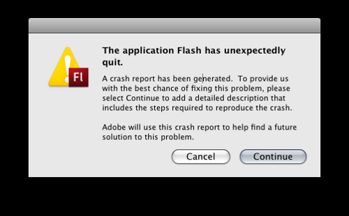
Flash error
Photo Credit: jonathanpoh via Compfight cc

Flash can look pretty awesome on a desktop computer. That’s the problem, though — a lot of users are accessing the Internet through their smartphones. It seems like everything and everyone loves smartphones except for one thing: Flash. Flash doesn’t play with mobile devices, and though many have tried to design a workaround, none have completely succeeded. For those that have succeeded in getting Flash to work on a mobile platform, they’ve experienced a lot of lock-ups and performance issues. By using Flash on your site, you’re completely alienating your audience.

It Takes a Long Time to Load

It’s been said that the average attention span of an Internet user is four to ten seconds. If you’ve ever dealt with Flash, you know that if you have any sort of awesome looking video, it’s not going to take three to five seconds to load. In fact, you’ll be lucky if it loads in under 15 seconds. During that time, you’re going to completely lose your mobile users because of the incompatibility of Flash, and the desktop users that you do get will likely navigate elsewhere rather than wait for your site to load. It’d be wise of you to completely ditch Flash and choose an introductory image or banner.

Not SEO Friendly

The goal of starting a website or a blog is to get users, right? Flash is completely counterproductive to that end. Flash isn’t index-able, so search engines won’t be able to do anything with it. Which would you rather have: an awesome intro or visitors who found your website from a search engine?

Very recently, both Yahoo and Google added the ability to see Flash videos. It requires a lot of extra steps by the site administrator to enable, and even then the search engines will likely not be able to see the text in the Flash video.

It’s Expensive

Flash doesn’t come cheap. It involves you buying the software to create the Flash video, which can cost $500 or more. You’ll also have to deal with maintenance and upgrade fees associated with the latest versions, and you’ll have to constantly update your creation. In contrast, HTML is very cheap and it’s extremely flexible.

It’s Difficult to Maintain

Once your Flash site is rolled out, it’s not easily editable. With HTML, you’re able to switch up the design as you see fit. If you’re using Flash, you’re out of luck. You’ll be unable to easily edit the link structure of your site, but even simple edits, like text, are a pain. You’ll have to completely take the Flash portion of your site down, decompile it, edit the content, recompile it, then upload it again to the website. It’s a long, boring procedure, and you’ll have to do it every single time you need to update anything.

Instability

In theory, Flash is a unique platform designed to show off your product — and to that end it’s effective. The problem, though, is that it’s not stable. You’ll need a plugin for your browser to watch the Flash video, Shockwave. Those with extremely old computers won’t be able to properly use Shockwave in their browser, and instead of seeing your intro, they’ll see a blank screen.

No matter how badly you want to incorporate Flash into your site, it might be better to leave it completely off. It limits your user base and it adds virtually nothing to your site.

Do you have any experience with Flash? If so, do you still use it? Leave a comment below and let us know.

Filed Under: Successful Blog, Web Design Tagged With: bc, Design, Flash, HTML

Get a Grip on Visual Content

April 8, 2014 by Rosemary Leave a Comment

By Lisa D. Jenkins

The saying, “A picture is worth a thousand words” is cliche for a reason.

It’s no secret that images receive more engagement on Facebook than their text only counterparts. The growth of audiences on Pinterest and Instagram, even Tumblr, supports the notion that at our core, we humans are a visual bunch.

And now there’s a whole lot of talk going around about visual content and its rapidly increasing influence online.

So, what exactly is this visual content all the cool kids are talking about? Let’s agree to set jargon aside and not make this harder than it has to be. We’re talking about images; photos, videos and graphics. Visual content uses all types of imagery to communicate and support your messaging clearly and quickly. As a delivery medium, visual content is perfectly suited to social media because it’s easily consumed and shared.

Lowe’s uses Vine shorts like this one to give helpful life hacks to their customers who then share the hack and extend Lowe’s reach and visibility.

From video to photos and infographics to animated GIFs, marketers are using visual content to their advantage in pursuit of goals such as establishing market authority, gaining share of voice, driving higher CTR’s and contributing to the bottom line.

One of the most attractive things about adding visual content into your online, digital and/or social marketing strategies is that you can include not only brand generated content but user generated content as well. With some forethought, your content creators get a break, and your fans get a nod from a brand they’re passionate about.

This collection of #sharelove images from Starbucks fans generated over 26k Likes, 200 Comments and 600 Shares – that’s a lot of news feed visibility, and we all know how hard that is to come by these days.

Starbucks visuals

If you want to learn more about what’s out there and how you can apply it to your own marketing activities, come back here every other Tuesday. I’ll share some examples of visual content from brands, give you some ideas for implementation and execution, and throw in a helpful tool or two to get you started.

What do you most want to learn?

For today, I’m just going to say thanks for dropping in and leave you with this infographic from On.com that explains how we got here.

The Growth of the Visual Web - On.com
Author’s Bio: Lisa D. Jenkins is a Public Relations professional specializing in Social and Digital Communications for businesses. She has over a decade of experience and work most often with destination organizations or businesses in the travel and tourism industry in the Pacific Northwest. Connect with her on Google+

Filed Under: Content, Design Basics, Successful Blog Tagged With: bc, Design, images, visuals

  • 1
  • 2
  • 3
  • …
  • 8
  • Next Page »

Recently Updated Posts

6 Keys to Managing Your Remote Workforce

9 Reasons To Use WordPress

Useful Marketing Tools That Wont Bust Your Budget

Do You Have What It Takes To Be A Successful Blogger?

Do You Have What It Takes To Be A Successful Blogger?

6 Tips for the Serial Side Hustler

How to Make Your Blog Popular


From Liz Strauss & GeniusShared Press

  • What IS an SOB?!
  • SOB A-Z Directory
  • Letting Liz Be

© 2023 ME Strauss & GeniusShared