By Teddy Hunt
Most major companies undergo an image rebranding process at some point in their life cycles.
Some companies have done it many times. Call it a sign of the times, a way of evolving to keep up with industry trends, or to reflect a brand’s changing dynamic. No matter what the reasoning behind it, it’s fun to look at the brands that we know and love today and see how much they’ve changed right in front of our eyes. Here, in no particular order, are five of the most recognizable company logo revamps ever.
1. Pepsi
Image by Hi Wave Event Creation
Pepsi has undergone so many image changes, it would be impossible to mention them all here.
What’s interesting to note is that the delicious fizzy drink was first introduced to the public in 1893 as “Brad’s Drink.” Coined after pharmacist Caleb Bradham, who first concocted what we now know as “Pepsi” in his drugstore. He made it out of carbonated water, vanilla, rare oils, sugar, pepsin, and cola nuts.
Since then, the Pepsi logo has undergone a number of image changes, each reflecting the trends of the times. These changes were each subtle in nature, but brought it to an image that hardly resembles the original logo at all.
2. Starbucks
Image via WebUrbanist.com
The latte-making coffee giant has reinvented its public image a number of times since its inception in 1971. As a testament to its successful brand recognition, Starbucks has stopped using its company name in its logo altogether. Much like Nike and Prince, it’ll now represent itself solely by a symbol.
3. Coca-Cola
Image via Flickr by Eric Kilby
Unlike its biggest competitor, Coca-Cola has always had the same name. Its logo, however, has most certainly changed with the times. The trademark swirly font has stuck around for the most part, but the shape and style of the rest of the logo have evolved, from having negative space around the name to a red background, the recognizable white swirl under the text, and the notable addition of the word “classic” under and “Enjoy” above the text.
Some periods of the logo featured a black background as an alternative to the classic red. The brand itself hasn’t changed, but the visual effect most certainly has.
4. Wal-Mart
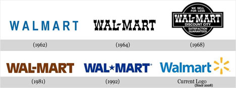
Image via WebUrbanist.com
Wal-Mart represents another internationally recognizable company logo that has changed several times. Since its inception in 1962, it has changed seven times. For the first 20 years or so, the logo had a frontier feel, but dropped it in 1981 when it opted for a brown version of the font we recognize today.
After nine years of the brown color scheme, the retail giant adopted the blue color scheme that has become synonymous with the Wal-Mart name. Finally, as part of its massive rebranding campaign that included the new slogan, “Save money, live better,” it slimmed down the font and added its now-iconic yellow spark.
5. UPS
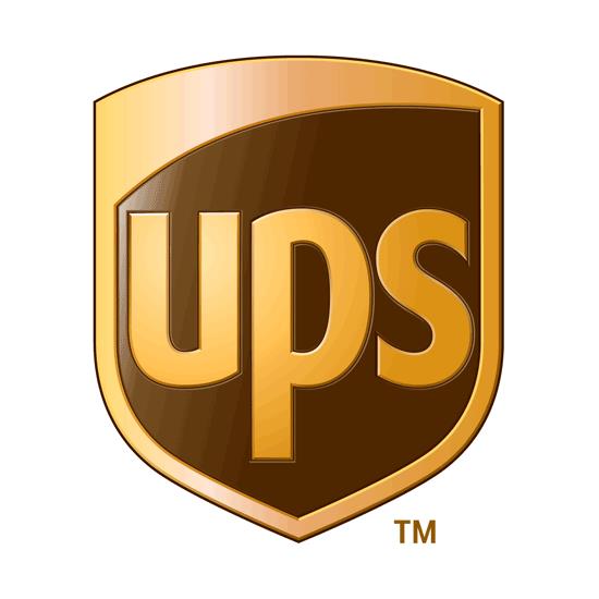
Image via ShareALogo
The United Parcel Service has stuck pretty close to its roots when it comes to its logo and marketing materials. The standard shield we’ve all come to know has been with UPS since it opened its Seattle doors in 1907. Back then it featured the silhouette of an eagle carrying a package in its talons. Since then the beloved parcel delivery service has only mildly tweaked its logo a few times.
However, the company underwent a worldwide rebranding process that included a sleek new logo to represent the company across all platforms. This new image stuck with the company’s traditional brown color scheme and shield but gave it a modern twist, adding a subtle 3-D effect and a sans-serif font while simultaneously coining the phrase “We [heart] logistics.”
In order to keep up with the ever-changing dynamic of today’s economy and consumer expectations, major corporations are constantly reinventing themselves.
What are some of the most recognizable logos you’ve noticed getting a facelift lately? Have you been inspired to take another look at your own logo?
Please share with us in the comments below.

