Successful Blog

  • Home
  • Community
  • About
  • Author Guidelines
  • Liz’s Book
  • Stay Tuned

Book Review, X: The Experience When Business Meets Design

April 14, 2016 by Rosemary Leave a Comment

Brian Solis is an award-winning author, blogger/writer, and futurist. His experience as principal analyst at the Altimeter Group research firm gave him wide ranging access to data, innovative technology, and business strategies that help companies connect with their customers.

His latest book, X: The Experience When Business Meets Design, makes the case that we need to move beyond just great products, creative marketing, and delightful customer experience.

We need to create meaningful experiences.

The book itself is an experience for the reader. It was designed with the intention of being surprising, engaging, and meaningful itself. The shape, the fonts, and the “chapter design,” all give the reader permission to create his/her own journey through the content.

the real customer journey

Meaningful experiences don’t happen by accident

My favorite summer job was when I worked as a tour narrator in Washington, DC. The training was intense; we went through two weeks of learning every detail contained in a 3-inch thick binder of material.

Each morning we’d be tested on the previous nights’ assignment. We had to pass the fact memorization part of the training before we could get on the tram microphone.

The magical part of the process? There was no script.

Once we memorized all of the facts, we were responsible for weaving them into an educational, entertaining narrative for our audience of tourists on the tram. That meant that every time someone hopped on a tram, they would be getting a fresh experience, based on the specific tour narrator at that moment.

It was a complete rush for me, designing that experience on the fly, every time the tram left the station.

“Shared experiences have become a critical part of marketing.” -Brian Solis

How to create meaningful experiences for your customers

  1. Map your customer journeys. You need to know what they are currently experiencing before you can offer a new perspective.
  2. Align your organization. To deliver experiences that resonate, you’ll need to get the whole team on board. Marketing, sales, developers, everyone.
  3. Create a plan. Decide how you will create an “experience layer” along the entire customer journey. Be sure to avoid any disconnects between pre-sale and post-sale experience.
  4. Listen. The experience process isn’t static. Pay attention to the signals your customers send out along the way, to find areas where you can improve the experience.

I’d recommend this book to anyone who wants to build a business that can survive and thrive into the future, as the power shifts from brand to consumer. It’s a deep dive, but very approachable. It makes a good reference book, since you can quickly pop into the structure at any point. There is also an interactive experience online to reinforce the messages.

Does your business strategy include the experience factor? What types of experiences could you provide for your customers?

Author’s Bio: Rosemary O’Neill is an insightful spirit who works for Social Strata — makers of the Hoop.la community platform. Check out the Social Strata blog. You can find Rosemary on Google+ and on Twitter as @rhogroupee


This book review was unsolicited and reflects my own opinion. I was not given a review copy of the book.

Filed Under: Design Tagged With: customer journey, Design

Image App Bonanza: 10 Apps to Spice Up Your Content

July 17, 2014 by Rosemary 2 Comments

According to ContentPlus UK, articles with images get 94% more views than those without. We have become scanners, racing through online posts and sifting for useful information.

Arresting images stop us in our tracks, and pull us into the surrounding text.

Beautiful butterfly image

This is a roundup of apps that I’ve personally road-tested for image manipulation. With the exception of PicMonkey, they are all installed on my iPhone right now.

Go forth and create fun, interesting photos. Just don’t let me catch you putting a “sunset” filter on your plate of salad. Don’t do that.

1. PicMonkey

Web app, Free with premium features
Handy, easy to use app that is great for banners, overlaying text, and resizing images. It covers much of the territory of Photoshop, without the long learning curve and big expense. My 8 year old kids started playing with PicMonkey and were cranking out great stuff immediately. Check out the “collage” feature.

2. KitCamera

Mobile app, Free with 99cent enhanced version
Successor to KitCam, which was acquired by Yahoo, and it’s the Swiss Army knife of mobile image editing apps. Great for live shooting as well as editing after the fact. This one is complex, but includes tons of pro photographer goodies, including filters, high speed shooting, and live editing. Check out the social sharing tools.

3. Vhoto

Mobile app, Free
Have you ever taken a great video, and wanted to pull a still image out for a thumbnail? Here’s your app. Vhoto will automatically find and suggest the best quality still images from a video clip. Use old videos or shoot a new one. Check out the Vhoto user community.

4. Flickr

Web and mobile app, Free with premium
Yes, I know you thought Flickr was gone. It’s not gone, but it’s been revamped, and looks better than ever. The mobile app is very easy to use, and will automatically sync up your photos if you like. Includes filters, pretty strong editing tools, and sharing. Did you know you can also upload videos?

5. Overgram

Mobile only, free
This app does one thing, but does it beautifully. Instantly add cool text to your Instagram photos. Choose font, size, text, and colors, and then save. Check out the beefier, paid Over app for even more editing tools.

6. Bubbsie

Mobile only, free
I had to include one completely fun one. Bubbsie makes it dead easy to create a “meme” image, by placing a thought or conversation bubble overlay on your images. Take a new photo, or overlay on an existing image from your gallery. Check out the picture frame feature.

7. Pixlromatic

Desktop, web, and mobile, free
The cool thing about this one (which I agree is unpronounceable), is that it’s so cross-platform. Use it almost anywhere. Take a photo with your webcam or device, or upload one from your library, and then enhance it with textures, backgrounds, and frames. Easy to use immediately. Check out the fun overlays (bubbles, fireworks).

8. Colorsplash

Web and mobile (special app for iPad), free
An App Store Hall of Famer, Colorsplash is the easiest way to colorize your photos. Turn your image black and white, and then selectively add color back to certain portions. Your colleagues will wonder how you did it. Check out the customizable brush sizes/shapes.

9. PhotoToaster

Mobile, paid app
Touch up, edit, crop, and highlight portions of your images in one app. Combines some of the best bits of ColorSplash and Pixlromatic, in an easy-to-use interface. Great for beginners, with lots of pre-sets. Check out PhotoMotion, from the same company, which lets you turn photos into videos.

10. PopAGraph

Mobile, free with premium upgrades available
Another cool tool for editing your photos, but it has some unique capabilities, including the ability to have separate filters on the background vs the foreground, multi-frames, and captions. Check out the video creator, with music. Share directly to Vine from within the app.

Have fun!

Note: I have zero affiliation with any of the above apps or companies, and no-one solicited these suggestions.

Author’s Bio: Rosemary O’Neill is an insightful spirit who works for social strata — a top ten company to work for on the Internet . Check out the Social Strata blog. You can find Rosemary on Google+ and on Twitter as @rhogroupee

Filed Under: Design, Successful Blog, Tools Tagged With: apps, bc, Design, graphics, tools

Why You Shouldn’t Put Your Title on a Business Card

April 10, 2014 by Rosemary 10 Comments

(Updated in 2020)

By Rob Young

If you’ve sought help to create the perfect business card you’ve probably found many people insist that you include your title on it. While including your title on a business card has its uses, in some cases it does more harm than good. Whether you’re the founder of a startup or an employee in an international company, these are a few reasons you might consider removing the title from your business card.

business cards

It can make you complacent

Printing your title on your business cards after you’ve just launched your start up might make you feel important, but it could be counter-productive. While it can inspire some people to take bold decisions and work night and day to ensure their business is a success, more commonly this false sense of importance clouds judgement and contributes to a false sense of achievement that leaves you vulnerable to complacency.

Leaving the title off your business card is a great (and free) way to remind yourself that you still have plenty to achieve — who knew that getting rid of a title could provide so much motivation?

You can appear egotistical or delusional

If you you’ve given yourself a fancy sounding title in the hopes of impressing potential clients, business partners or even your employees, be prepared for the opposite, especially if you appear young and inexperienced. At best people could think that you have an inflated ego, which might put people off from working with you. Worse still, you might just come across as delusional, with an unrealistic and immature approach to business.

It limits you

A job title is meant to give people an idea of what you do, but sometimes it can unintentionally give them a false impression of what you don’t do and if someone thinks you’re incapable of doing something and chooses not to pursue a relationship with you your business card might as well have been a blank piece of paper. Leave the job title off your business card and you give yourself the flexibility to adapt your responsibilities and abilities to the individual situation. And remember, as long as you have a pen handy, you can always add information to a business card.

Going incognito has its benefits

You might imagine that it’s always best to introduce yourself as the boss, but if you’ve ever seen Undercover Boss you’ll understand the value of being able to assume a different role. Whether it’s trying to leverage a better deal with a supplier or find out what other people really think of your company, the ability to be a chameleon in business comes with many benefits.

It’s a conversation starter

Maintaining a little bit of mystery is a great way to pique someone’s interest. Remove your job title from your business card and you’’ll find that people will start asking what exactly it is you do. This is a great opportunity to really sell yourself and the business you represent, you don’t have to reply with just your job title. Just bear in mind that removing all your details from your business card will only make you look foolish and incompetent.

It looks elegant, bold and chic

It’’s universally accepted that your business card shouldn’t be overloaded with information. Being ruthless and leaving out unnecessary details is a straightforward way to make an impact with your business card. Think your title is a necessary detail? Think again. Your email address or contact telephone number is essential, your title is an extra.

To avoid politics and resentment

Titles could lead to resentment and jealousy in a company. You could say that such employees shouldn’t be appeased by leaving job titles off business cards, but if something so simple could lead to a more productive company culture shouldn’t it at least be considered, especially when there are so many other reasons to ditch titles?
Do you really need that title?

Of course there are plenty of valid reasons to include your title on a business card, if you’re dealing with businesspeople with inflated egos, for example, they might consider titles important enough that they only want to deal with people they believe to be on their level. What’s important is that you don’t assume your job title should automatically be on your business card. Instead weigh up the pros and cons and do what’s best for your business or career.

Author’s Bio: Rob Young is Head of Online Marketing at business card printers MOO. He likes to share his knowledge and experience on a number of topics including networking and design.

Photo Credit: antoniocasas – homofotograficus.com via Compfight cc

Filed Under: Design, Personal Branding, Successful Blog Tagged With: branding, business cards, marketing

Instant Impressions: 7 Popular Web Design Trends

April 4, 2014 by Rosemary 1 Comment

By Teddy Hunt

The Internet is continuously involving, and people are constantly finding new ways to attract others to their website. Design trends are about as shifty as fashion, so it’s important to keep your website updated with the latest that web design has to offer. With that said, here are seven of the most popular web design trends spicing things up in 2014.

Funky Typography

Funky as in experimental, not funky as in overly complex and unreadable. Graphic designers are having as much fun as ever playing around with fonts and injecting them with flare. These fonts are spicier than your average serif or san-serif like Times New Roman or Helvetica. As the web further expands and more people take to creating their own websites, the need to branch out and come up with unique fonts that stand out is more important than ever before.

Super-Sized Navigation Menus

There’s been a plethora of fancy navigation menus designed, tested, and approved over the past few years, with mobile responsive design (we’ll get to that later) and HTML5/CSS3 influencing that. But the most recent trend seems to involve super-sized menus that expand to huge blocks of content and links. These menus are commonly found on websites that publish great volumes of unique content in high volumes. Although it takes up a lot of space on the page, it provides visitors a broader choice to navigate your website.

Mobile-First Design

The purpose of mobile-first design is to develop your website so that it has a responsive layout that’s accessible by mobile users without sacrificing quality. Essentially, you want to cut of the excess fluff and keep the critical elements. From this perspective, it’s easier to scale up your website’s design to devices that have wider screens. Mobile-first design emphasizes the mobile experience and becomes the foundation for the entire layout. Just make sure that you’re not committing mobile web design mistakes when designing your website.

More Videos

Website visitors are spending less time reading text and more time watching videos and looking at pictures (infographics). With that in mind, it’s time to trash the boring blurbs about what your company can offer and showcase that point in video format (don’t make them too long, though).

Not only is this media format more popular today, but it’s also easily sharable on social media, resulting in more views and greater brand awareness.

Endless Scrolling

Guess what? Scrolling through an in-depth website is easier and faster than clicking through 25 different links to get access to the information you want — and graphic designers are noticing.

These websites aren’t cluttered with content on long scrolling pages, either.

Designers use new website design techniques to format and organize the content in a way that’s easy to read and comprehend. Endless scrolling design can change the layout and design of the page as your scroll further, making you forget you’re scrolling through a lot of information to begin with.

Simple and Subtle Color Schemes

color wheel

The days of eye-popping graphics, complex animations, and crazy color schemes are coming to an end — at least for now. If you’re a smart graphic designer, you’ll use one or two colors instead in the future. One of the more popular trends today is to use a single bright color and a single clean background color like red, teal, or orange (including images or black and white text on top). Not only is this effect minimalistic, but it’s user-friendly.

3D Transition Effects

Whether it’s in animated image galleries, elements, or navigation menus, 3D animations are becoming more popular by the day. You can create 3D effects using jQuery; although, CSS3 has slowly caught up. Unfortunately, not all browsers support these types of animations, so designers avoid using too many on one page. Check out these 3D animated code examples to work from if you want to give a shot.

What website design trends do you expect in the near future? Have you implemented any that make your website stand out better than before? Leave a comment and share your thoughts on the subject.

Author’s Bio: Teddy Hunt is a freelance content writer with a focus on technology. When not behind a computer, Teddy spends the majority of his free time outdoors and resides in Tampa, Florida.

Photo Credit: Viktor Hertz via Compfight cc

Filed Under: Design, Web Design Tagged With: bc, fonts, graphics, web design

5 of the Most Recognizable Company Logo Revamps Ever

March 21, 2014 by Rosemary 3 Comments

By Teddy Hunt

Most major companies undergo an image rebranding process at some point in their life cycles.

Some companies have done it many times. Call it a sign of the times, a way of evolving to keep up with industry trends, or to reflect a brand’s changing dynamic. No matter what the reasoning behind it, it’s fun to look at the brands that we know and love today and see how much they’ve changed right in front of our eyes. Here, in no particular order, are five of the most recognizable company logo revamps ever.

1. Pepsi

Pepsi logo

Image by Hi Wave Event Creation

Pepsi has undergone so many image changes, it would be impossible to mention them all here.

What’s interesting to note is that the delicious fizzy drink was first introduced to the public in 1893 as “Brad’s Drink.” Coined after pharmacist Caleb Bradham, who first concocted what we now know as “Pepsi” in his drugstore. He made it out of carbonated water, vanilla, rare oils, sugar, pepsin, and cola nuts.

Since then, the Pepsi logo has undergone a number of image changes, each reflecting the trends of the times. These changes were each subtle in nature, but brought it to an image that hardly resembles the original logo at all.

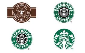
2. Starbucks

Starbucks logos

Image via WebUrbanist.com

The latte-making coffee giant has reinvented its public image a number of times since its inception in 1971. As a testament to its successful brand recognition, Starbucks has stopped using its company name in its logo altogether. Much like Nike and Prince, it’ll now represent itself solely by a symbol.

3. Coca-Cola

Coca-Cola logos

Image via Flickr by Eric Kilby

Unlike its biggest competitor, Coca-Cola has always had the same name. Its logo, however, has most certainly changed with the times. The trademark swirly font has stuck around for the most part, but the shape and style of the rest of the logo have evolved, from having negative space around the name to a red background, the recognizable white swirl under the text, and the notable addition of the word “classic” under and “Enjoy” above the text.

Some periods of the logo featured a black background as an alternative to the classic red. The brand itself hasn’t changed, but the visual effect most certainly has.

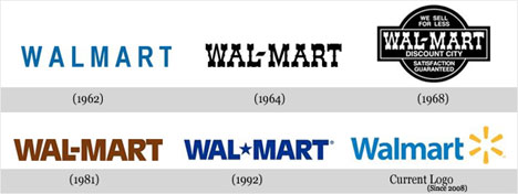
4. Wal-Mart

Wal-Mart Logo

Image via WebUrbanist.com

Wal-Mart represents another internationally recognizable company logo that has changed several times. Since its inception in 1962, it has changed seven times. For the first 20 years or so, the logo had a frontier feel, but dropped it in 1981 when it opted for a brown version of the font we recognize today.

After nine years of the brown color scheme, the retail giant adopted the blue color scheme that has become synonymous with the Wal-Mart name. Finally, as part of its massive rebranding campaign that included the new slogan, “Save money, live better,” it slimmed down the font and added its now-iconic yellow spark.

5. UPS

UPS Logo

Image via ShareALogo

The United Parcel Service has stuck pretty close to its roots when it comes to its logo and marketing materials. The standard shield we’ve all come to know has been with UPS since it opened its Seattle doors in 1907. Back then it featured the silhouette of an eagle carrying a package in its talons. Since then the beloved parcel delivery service has only mildly tweaked its logo a few times.

However, the company underwent a worldwide rebranding process that included a sleek new logo to represent the company across all platforms. This new image stuck with the company’s traditional brown color scheme and shield but gave it a modern twist, adding a subtle 3-D effect and a sans-serif font while simultaneously coining the phrase “We [heart] logistics.”

In order to keep up with the ever-changing dynamic of today’s economy and consumer expectations, major corporations are constantly reinventing themselves.

What are some of the most recognizable logos you’ve noticed getting a facelift lately? Have you been inspired to take another look at your own logo?

Please share with us in the comments below.

Author’s Bio: Teddy Hunt is a freelance content writer with a focus on technology. When not behind a computer, Teddy spends the majority of his free time outdoors and resides in Tampa, Florida.

Filed Under: Design, Successful Blog Tagged With: bc, branding, Design, logo

Working With Designers Should be Joyful, Not Painful

March 7, 2014 by Rosemary Leave a Comment

By Paul Biedermann

working with designers should be joyful

Good designers are hard to find and sometimes even harder to work with. But it doesn’t need to be this way.

It is common for a client to ask for something and then wonder why the designer won’t just give them what they want. After all, “the customer is always right.”

Wrong.

That may work in a fast food restaurant or a shoe store, but when it comes to working in the area of professional design communications, it gets a bit more complex than that. And really, you — as the client — shouldn’t want it any other way. In fact, if a designer isn’t asking questions and challenging assumptions, they are probably not very good and you won’t be realizing the full power of what design can bring to your business.

The key is to not interpret pushback as being difficult, but rather as a welcomed and necessary part of the process for doing good work. In other words, the way to begin a project with a designer is not by telling them what to do, but rather by laying out the objectives to be achieved and then letting them recommend a solution. Designers are problem solvers, not decorators. Design usually satisfies a host of different needs and requirements, and that means a defined process is necessary to get there.

So, if a designer seems like they are giving resistance and aren’t listening to what you want, it is possible that they are simply trying to pursue the path to success, which isn’t always as clear cut as it may seem. It may also include redefining the problem in order to proceed most effectively and arrive at the best solution for your business. And if they keep coming back to the same questions, it is likely they haven’t yet received the information they need to do their jobs well — so rather than writing it off as being difficult, it’s worth keeping an open mind that perhaps they really have only your best interests at heart.

The best design experiences occur when the designer and client work in collaboration, each respecting the other’s contributions to a successful outcome.

The perfect client:

• Clearly articulates the goals, objectives and problem to be solved.

• Provides any supporting information and practical considerations pertinent to the project.

• Is timely in reviewing preliminary designs and responsive to any communications

• Understands that the designer is as interested in the successful outcome of the project as they are.

A good designer:

• Pays careful attention to the goals of the project and what needs to be accomplished.

• Requests any details, information or content necessary for proceeding with the project that hasn’t already been provided.

• Stays on top of the schedule and keeps the client engaged at key phases throughout the duration of the project.

• Understands that the client is the ultimate decision-maker and does what is necessary to ensure as smooth a process as possible for an effective design solution.

This is a quick summary, of course — but these are the key roles and responsibilities that any successful design collaboration requires. If friction develops at any point during the process, it is usually because one of these points is missed.

Don’t make the mistake of dismissing someone who is persistent for a “defensive designer” with a big ego. Those exist too, of course, but it is usually a matter of someone who has practiced their craft for a long time, knows how to get the job done, and is passionate about what they do. Respect their expertise and they will respect yours, and it will likely be a fruitful process for both of you — and the project wins.

The design process can be fun, challenging and invigorating. For that to happen, it is important that each side fulfills its basic responsibilities — working together, which also means letting the other side do what it does best.

Embracing ambiguity during the often “murky” process of design can have a big payoff down the road — but it also means trusting your designer, so make sure you hire a good one!

Author’s Bio: Paul Biedermann is the Creative Director/Owner of re:DESIGN, a small design agency specializing in Strategic Design, Brand Identity, and Visual Content Marketing — intersecting smart design with business strategies that reach, engage, and inspire people to action. Blending traditional and leading-edge media tactics. Paul consistently delivers integrated, award-winning results for his clients. Connect with him on Google+ or Twitter.


Image via Creative Commons, Amber De Bruin.

Filed Under: Design, Successful Blog Tagged With: bc, Design, project management

  • 1
  • 2
  • 3
  • …
  • 16
  • Next Page »

Recently Updated Posts

6 Keys to Managing Your Remote Workforce

9 Reasons To Use WordPress

Useful Marketing Tools That Wont Bust Your Budget

Do You Have What It Takes To Be A Successful Blogger?

Do You Have What It Takes To Be A Successful Blogger?

6 Tips for the Serial Side Hustler

How to Make Your Blog Popular


From Liz Strauss & GeniusShared Press

  • What IS an SOB?!
  • SOB A-Z Directory
  • Letting Liz Be

© 2023 ME Strauss & GeniusShared