Successful Blog

Here is a good place for a call to action.

  • Home
  • Community
  • About
  • Author Guidelines
  • Liz’s Book
  • Stay Tuned

6 Reasons You Need to Stop Wasting Your Time With Flash on Your Website

May 2, 2014 by Rosemary

By Teddy Hunt

When you design your website, there are a lot of things that you take into consideration. You worry about the design colors; you worry about your site’s compatibilities across different devices; and you worry about your website looking good. For a stylish effect, it’s likely that you’ve tried to implement Flash on your page. That’s a huge mistake, and here are a few reasons that you need to stop using it right now.

It’s Not Compatible With Everything

Flash error
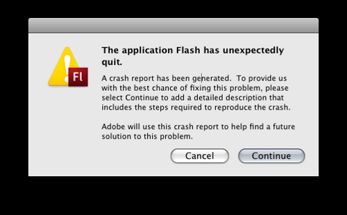
Photo Credit: jonathanpoh via Compfight cc

Flash can look pretty awesome on a desktop computer. That’s the problem, though — a lot of users are accessing the Internet through their smartphones. It seems like everything and everyone loves smartphones except for one thing: Flash. Flash doesn’t play with mobile devices, and though many have tried to design a workaround, none have completely succeeded. For those that have succeeded in getting Flash to work on a mobile platform, they’ve experienced a lot of lock-ups and performance issues. By using Flash on your site, you’re completely alienating your audience.

It Takes a Long Time to Load

It’s been said that the average attention span of an Internet user is four to ten seconds. If you’ve ever dealt with Flash, you know that if you have any sort of awesome looking video, it’s not going to take three to five seconds to load. In fact, you’ll be lucky if it loads in under 15 seconds. During that time, you’re going to completely lose your mobile users because of the incompatibility of Flash, and the desktop users that you do get will likely navigate elsewhere rather than wait for your site to load. It’d be wise of you to completely ditch Flash and choose an introductory image or banner.

Not SEO Friendly

The goal of starting a website or a blog is to get users, right? Flash is completely counterproductive to that end. Flash isn’t index-able, so search engines won’t be able to do anything with it. Which would you rather have: an awesome intro or visitors who found your website from a search engine?

Very recently, both Yahoo and Google added the ability to see Flash videos. It requires a lot of extra steps by the site administrator to enable, and even then the search engines will likely not be able to see the text in the Flash video.

It’s Expensive

Flash doesn’t come cheap. It involves you buying the software to create the Flash video, which can cost $500 or more. You’ll also have to deal with maintenance and upgrade fees associated with the latest versions, and you’ll have to constantly update your creation. In contrast, HTML is very cheap and it’s extremely flexible.

It’s Difficult to Maintain

Once your Flash site is rolled out, it’s not easily editable. With HTML, you’re able to switch up the design as you see fit. If you’re using Flash, you’re out of luck. You’ll be unable to easily edit the link structure of your site, but even simple edits, like text, are a pain. You’ll have to completely take the Flash portion of your site down, decompile it, edit the content, recompile it, then upload it again to the website. It’s a long, boring procedure, and you’ll have to do it every single time you need to update anything.

Instability

In theory, Flash is a unique platform designed to show off your product — and to that end it’s effective. The problem, though, is that it’s not stable. You’ll need a plugin for your browser to watch the Flash video, Shockwave. Those with extremely old computers won’t be able to properly use Shockwave in their browser, and instead of seeing your intro, they’ll see a blank screen.

No matter how badly you want to incorporate Flash into your site, it might be better to leave it completely off. It limits your user base and it adds virtually nothing to your site.

Do you have any experience with Flash? If so, do you still use it? Leave a comment below and let us know.

Filed Under: Successful Blog, Web Design Tagged With: bc, Design, Flash, HTML

6 Reasons Poor Web Design Drives Traffic Away From Your Site

March 11, 2014 by Rosemary

By Teddy Hunt

The purpose of designing a website is to drive traffic to it. When it’s done well, you’ll get more views and effectively promote the product or service you’re selling. If you’re not getting the results you want, perhaps your website’s design just isn’t cutting it. Sure, you might think it’s as attractive as a pot of gold, but that doesn’t mean people who are visiting it will think so too.

Fortunately, some of your problems might just stem from fundamental design issues.

With that said, here are six reasons poor web design drives traffic away from your site, and how to fix it.

1. Your Design Includes a Hideous Background

The fastest way to drive traffic away from your website is to incorporate a background that’s hideous enough scare a blind man. A bad background is either overly busy, poorly contrasted, or animated. If you think your obnoxious background will keep users’ attention, think again.

Instead, use one single color for your background and keep it as simple as possible. If you use more than one color, make sure they compliment each other in a subtle way.

2. Your Design is Tough to Navigate

Getting people to visit your website is an accomplishment in and of itself, but if you’re not keeping them there then what’s the point. A website that’s tough to navigate is another way to keep people from coming back once they click the “x” on the top-right corner of the browser.

People don’t want to aimlessly search for what they want or need. Organize your website strategically so that users can easily navigate it without getting lost and left for dead.

3. Your Design Interrupts the User Experience

Even if your website is easy to navigate, annoying your visitors by constantly bombarding them with pop-up requests and ads will quickly have them running — or better yet, clicking — for the hills. In an online world filled with websites that cater to users’ wants and needs, yours needs to instantly satisfy your visitors without making them work too hard to feel that gratification. Keep the ads and requests to a minimum and you’ll do just that.

4. Your Design is Poorly Planned and Executed

With regard to planning, make sure the person you recruit to build the site is up to par. It is really step-one to your overhaul. If you’re not able to craft your own website, rely on experts who can do the job. Before you look to bring in a qualified individual or team, check yourself first. Make certain your company or organization has a clear vision and a strong reputation. This will ensure a quality hire.

Practically speaking, if you approach designing your website like an improv comedian does his or her act than chances are you’ll get more people leaving your website than he or she does laughs. Building and designing a website that serves its purpose — drives traffic and makes you money — takes time, effort, and patience. Before rushing into this project, carefully plan and prepare how you want your site to look by using a website wire frame to map it out.

With regard to planning, make sure the person you hire is on the same page. Recruiting and reigning in a top talent is really step-one to your design. If you’re not able to craft your own website, rely on experts who can do the job.

5. Your Design Doesn’t Have a Consistent Layout

An inconsistent website not only deters people from visiting it, but it makes your brand look unprofessional. When designing your (consistent) website, be sure to stay away from some of these bad design habits.

• Loud and distracting colors

• Large and bold fonts that seem to “SHOUT” and not “state”

• Small and unreadable fonts that users can’t decipher

• Visually unbalanced pages (poor text-to-image ratio)

• Spelling and grammar errors

• Inconsistent styles, color themes, and formats

• Not making sure the layout displays properly on all Internet browsers

If you pay extra attention to these points, you’ll be well on your way to designing a consistent website.

6. Your Design Includes Flash

Although animations can still have a place on your website (of course, on a very limited basis), it’s more strategic to use an HTML website because it’s properly indexed by search engines and it works on almost all modern devices. If your website visitors are accessing it on a smartphone and your website is Flash, chances are they’ll have trouble viewing it. Essentially, you want to stick to HTML websites so that you don’t waste your time and efforts designing.

If you keep some important points in mind, designing a website won’t seem as difficult as giving a heart transplant.

What are some other tips you can offer website designers looking to drive traffic? Leave a comment below.

Author’s Bio: Teddy Hunt is a freelance content writer with a focus on technology. When not behind a computer, Teddy spends the majority of his free time outdoors and resides in Tampa, Florida.

Filed Under: Successful Blog, Web Design Tagged With: bc, HTML, web design

Benefits of Using a Website Builder

July 26, 2013 by Rosemary

By Zubin Kutar

If you want to start a new website, you have two options. You can either go through the long and frustrating process of creating code for every page, or simply use a website builder. Some of the most popular website builder tools in the market include Squarespace, Weebly, Wix, Volution, WordPress, GoDaddy, Webs, Yola, 1&1 and Homestead.

Here are some of the benefits of using website builder tools.

1. No need for technical expertise

To build a professional website, you don’t have to be a graphic designer or web designer. Even if you don’t have technical knowledge, you can use website builders to create an attractive and fully functional site. You can choose from a wide range of templates which allow you to customize the font styles and colors. In addition, you can add graphics, images and other design elements according to your needs. With just a few clicks, your site can be up and running within minutes.

2. Reduced time

One of the main disadvantages of hiring a professional designer is that it might take a long time before the site is ready. Creating a custom site requires a lot of time for writing and testing code. In addition, the web designer might also have other projects taking up his time, thus delaying your work even further. Since website builders come with inbuilt code and scripts, you can set up your site much faster. This also means that you don’t have to spend any time testing your inputs and parameters to see if they are functional.

3. Reduced cost

If you intend to use your site for business, it would be advisable to go for a custom website design. However, if you have a limited budget, a website builder can come in handy. Once your business becomes profitable, you can then hire an expert to upgrade your site. Website builders can also significantly cut down startup costs when you want to launch several websites.

4. Stock images

Photos and graphics play a very important role in enhancing the appearance of your web pages. Website builders usually come with a wide variety of free graphics and stock photos. This will save you the cost of having to hire a professional photographer or graphic designer. Since there are different kinds of stock photos, you are likely to find great images which are relevant to the theme of your site.

5. Drag and drop design

Once in a while, you might want to change the look and feel of your website. Instead of spending lots of time writing new code, you can simply use a website builder to make the desired alterations to your site. For instance, to move any of the elements in your site, all you need to do is drag it to its new position and drop it there. This means that the appearance of your site can be transformed in a matter of seconds.

6. Content management

Website builders make it easy for you to add and update content on your site. These tools offer you access to a ‘backroom’ area where you can post your text content, as well as upload images. In addition, you can edit the content just as you would with a word processing program. Website builders allow you to add as much content as you want, whenever you want.

What is your favorite website builder?

Author’s Bio: Zubin Kutar is the founder of an internet marketing blog where accomplished writers and bloggers share their tips, strategies and stories. Read some of his inspirational posts and connect with him on Google+.

Filed Under: Successful Blog Tagged With: bc, HTML, web design, website

EchoEcho on and on and on

June 11, 2006 by Liz

Use at Your Own Risk

This is SO COOL and SO DANGEROUS. If you know what small bit I do about coding, it might be a good idea to back up your template files before you start playing with this new toy. . . .

Great Find: EchoEcho
Type of Site:
Encyclopedia of information on how to build and maintain websites — This section: HTML Basics
Permalink: HTML Basics: http://www.echoecho.com/html.htm
Target Audience: Every blogger can find something useful on this site

Content: On the home page of EchoEcho, you’ll see this quote

“It’s easy to explain simple things so they seem to be complex…
to explain complex things so they seem easy – that’s the real challenge!”

The webmaster at EchoEcho has taken on the above challenge, and goes further by attempting to add the word complete. I’m not using hyperbole when I call this an encyclopedia of information about building websites. EchoEcho is a hosting company that knows how to establish credibility through ezine artitcles, tutorials, a forum, online tools free resources, even a quiz.

The Tutorials are divided into three categories each of has subcatagories that cover several topics, talking each one many levels deep. Here are the categories and categories you’ll find there.

  • Page Building: HTML, Javascript, CSS, DTML, XML.
  • Component Building: Design, Flash, Java, Free Java Applets, Java Programming Tutorials
  • Server Programming: ASP, Cold Fusion, PERL, PHP, SSI

I’ve set the link to the HTML Tutorial on the titleshot below. Click on over. EchoEcho is a reference to keep.

EchoEcho HTML Tutorials

There’s no questions that every blogger at every level can use this resource.

EchoEcho has plenty of tools and things to learn, do, and make here for free — ways to add unique details, ways to differentiate your brand, ways to add to your blog’s curb appeal . . . ALSO ways to overdo the bells and whistles BIG TIME . . . ways to screw up your template too, if you you’re like me.

I think I’ll ask friend to come along when I explore this site. I could get into some real trouble easily.

Good luck and enjoy!

–ME “Liz” Strauss

Related
I’ll be adding this Great Find to the NEW BLOGGER Page.
You’ll find other pages there and in the Tools and Stat/Tech categories.

Filed Under: Blog Basics, Successful Blog, Tools Tagged With: bc, blog-promotion, CSS, DTML, EchoEcho, Free-Java-Applets, Great-Find, HTML, Html-tutorial, Javascript, personal-branding, XML

Color and Font Codes

May 7, 2006 by Liz

HTML Color and Font Codes

New Blogger Logo

When I first started blogging, I was anxious to do what I could do in print–add emphasis using color or maybe once on a rare occasion change the font for flavor. But I was new to HTML and the rules had me baffled. I recently found this simple tutorial that not only shows how, but also shows which fonts are those that usually work.

Great Find: Color in Your Text from Writing up.com
Type of article: HTML tutorial
Permalink: http://www.writingup.com/htmltutor/color_in_your_text_from_htmltutor
Target Audience: Folks who want to know more about HTML
Content: This tutorial starts out with the basic code for changing the font and the color of your text.

Then the tutorial offers two clicks further. The first click takes you to choosing type fonts. While you are there, you can see how each font looks and check whether it is available on your computer. The second click shows you a basic color chart and color words to allow a chance for experimentation.

This tutorial is great for new bloggers or for seasoned bloggers in a hurry looking for a color change in their typography.

Click this screenshot title to go there.

Color In Your Text Article

I’m adding this to the NEW BLOGGER PAGE in the side bar.

–ME “Liz Strauss

Related articles
Great Finds: EchoEcho on and on and on Coding Tools
Great Find: Adding Show-Hide and Categories
Stand-Alone Trackback Tool from WhizbangTech
SEO–Link Checking Tools

Filed Under: Blog Basics, Design, Successful Blog, Tools Tagged With: bc, blogging_basics, coding_fonts, color_fonts, Design, HTML, new_bloggers, tools, tutorials

Recently Updated Posts

How to Use a Lead Generation Item on Facebook

How to Become a Better Storyteller

SEO and Content Marketing

How to Use Both Content Marketing and SEO to Amplify Your Blog

9 Practical Work-at-Home Ideas For Moms

How to Monetize Your Hobby

How To Get Paid For Sharing Your Travel Stories


From Liz Strauss & GeniusShared Press

  • What IS an SOB?!
  • SOB A-Z Directory
  • Letting Liz Be

© 2025 ME Strauss & GeniusShared