Successful Blog

  • Home
  • Community
  • About
  • Author Guidelines
  • Liz’s Book
  • Stay Tuned

6 Reasons Poor Web Design Drives Traffic Away From Your Site

March 11, 2014 by Rosemary

By Teddy Hunt

The purpose of designing a website is to drive traffic to it. When it’s done well, you’ll get more views and effectively promote the product or service you’re selling. If you’re not getting the results you want, perhaps your website’s design just isn’t cutting it. Sure, you might think it’s as attractive as a pot of gold, but that doesn’t mean people who are visiting it will think so too.

Fortunately, some of your problems might just stem from fundamental design issues.

With that said, here are six reasons poor web design drives traffic away from your site, and how to fix it.

1. Your Design Includes a Hideous Background

The fastest way to drive traffic away from your website is to incorporate a background that’s hideous enough scare a blind man. A bad background is either overly busy, poorly contrasted, or animated. If you think your obnoxious background will keep users’ attention, think again.

Instead, use one single color for your background and keep it as simple as possible. If you use more than one color, make sure they compliment each other in a subtle way.

2. Your Design is Tough to Navigate

Getting people to visit your website is an accomplishment in and of itself, but if you’re not keeping them there then what’s the point. A website that’s tough to navigate is another way to keep people from coming back once they click the “x” on the top-right corner of the browser.

People don’t want to aimlessly search for what they want or need. Organize your website strategically so that users can easily navigate it without getting lost and left for dead.

3. Your Design Interrupts the User Experience

Even if your website is easy to navigate, annoying your visitors by constantly bombarding them with pop-up requests and ads will quickly have them running — or better yet, clicking — for the hills. In an online world filled with websites that cater to users’ wants and needs, yours needs to instantly satisfy your visitors without making them work too hard to feel that gratification. Keep the ads and requests to a minimum and you’ll do just that.

4. Your Design is Poorly Planned and Executed

With regard to planning, make sure the person you recruit to build the site is up to par. It is really step-one to your overhaul. If you’re not able to craft your own website, rely on experts who can do the job. Before you look to bring in a qualified individual or team, check yourself first. Make certain your company or organization has a clear vision and a strong reputation. This will ensure a quality hire.

Practically speaking, if you approach designing your website like an improv comedian does his or her act than chances are you’ll get more people leaving your website than he or she does laughs. Building and designing a website that serves its purpose — drives traffic and makes you money — takes time, effort, and patience. Before rushing into this project, carefully plan and prepare how you want your site to look by using a website wire frame to map it out.

With regard to planning, make sure the person you hire is on the same page. Recruiting and reigning in a top talent is really step-one to your design. If you’re not able to craft your own website, rely on experts who can do the job.

5. Your Design Doesn’t Have a Consistent Layout

An inconsistent website not only deters people from visiting it, but it makes your brand look unprofessional. When designing your (consistent) website, be sure to stay away from some of these bad design habits.

• Loud and distracting colors

• Large and bold fonts that seem to “SHOUT” and not “state”

• Small and unreadable fonts that users can’t decipher

• Visually unbalanced pages (poor text-to-image ratio)

• Spelling and grammar errors

• Inconsistent styles, color themes, and formats

• Not making sure the layout displays properly on all Internet browsers

If you pay extra attention to these points, you’ll be well on your way to designing a consistent website.

6. Your Design Includes Flash

Although animations can still have a place on your website (of course, on a very limited basis), it’s more strategic to use an HTML website because it’s properly indexed by search engines and it works on almost all modern devices. If your website visitors are accessing it on a smartphone and your website is Flash, chances are they’ll have trouble viewing it. Essentially, you want to stick to HTML websites so that you don’t waste your time and efforts designing.

If you keep some important points in mind, designing a website won’t seem as difficult as giving a heart transplant.

What are some other tips you can offer website designers looking to drive traffic? Leave a comment below.

Author’s Bio: Teddy Hunt is a freelance content writer with a focus on technology. When not behind a computer, Teddy spends the majority of his free time outdoors and resides in Tampa, Florida.

Filed Under: Successful Blog, Web Design Tagged With: bc, HTML, web design

Working With Designers Should be Joyful, Not Painful

March 7, 2014 by Rosemary

By Paul Biedermann

working with designers should be joyful

Good designers are hard to find and sometimes even harder to work with. But it doesn’t need to be this way.

It is common for a client to ask for something and then wonder why the designer won’t just give them what they want. After all, “the customer is always right.”

Wrong.

That may work in a fast food restaurant or a shoe store, but when it comes to working in the area of professional design communications, it gets a bit more complex than that. And really, you — as the client — shouldn’t want it any other way. In fact, if a designer isn’t asking questions and challenging assumptions, they are probably not very good and you won’t be realizing the full power of what design can bring to your business.

The key is to not interpret pushback as being difficult, but rather as a welcomed and necessary part of the process for doing good work. In other words, the way to begin a project with a designer is not by telling them what to do, but rather by laying out the objectives to be achieved and then letting them recommend a solution. Designers are problem solvers, not decorators. Design usually satisfies a host of different needs and requirements, and that means a defined process is necessary to get there.

So, if a designer seems like they are giving resistance and aren’t listening to what you want, it is possible that they are simply trying to pursue the path to success, which isn’t always as clear cut as it may seem. It may also include redefining the problem in order to proceed most effectively and arrive at the best solution for your business. And if they keep coming back to the same questions, it is likely they haven’t yet received the information they need to do their jobs well — so rather than writing it off as being difficult, it’s worth keeping an open mind that perhaps they really have only your best interests at heart.

The best design experiences occur when the designer and client work in collaboration, each respecting the other’s contributions to a successful outcome.

The perfect client:

• Clearly articulates the goals, objectives and problem to be solved.

• Provides any supporting information and practical considerations pertinent to the project.

• Is timely in reviewing preliminary designs and responsive to any communications

• Understands that the designer is as interested in the successful outcome of the project as they are.

A good designer:

• Pays careful attention to the goals of the project and what needs to be accomplished.

• Requests any details, information or content necessary for proceeding with the project that hasn’t already been provided.

• Stays on top of the schedule and keeps the client engaged at key phases throughout the duration of the project.

• Understands that the client is the ultimate decision-maker and does what is necessary to ensure as smooth a process as possible for an effective design solution.

This is a quick summary, of course — but these are the key roles and responsibilities that any successful design collaboration requires. If friction develops at any point during the process, it is usually because one of these points is missed.

Don’t make the mistake of dismissing someone who is persistent for a “defensive designer” with a big ego. Those exist too, of course, but it is usually a matter of someone who has practiced their craft for a long time, knows how to get the job done, and is passionate about what they do. Respect their expertise and they will respect yours, and it will likely be a fruitful process for both of you — and the project wins.

The design process can be fun, challenging and invigorating. For that to happen, it is important that each side fulfills its basic responsibilities — working together, which also means letting the other side do what it does best.

Embracing ambiguity during the often “murky” process of design can have a big payoff down the road — but it also means trusting your designer, so make sure you hire a good one!

Author’s Bio: Paul Biedermann is the Creative Director/Owner of re:DESIGN, a small design agency specializing in Strategic Design, Brand Identity, and Visual Content Marketing — intersecting smart design with business strategies that reach, engage, and inspire people to action. Blending traditional and leading-edge media tactics. Paul consistently delivers integrated, award-winning results for his clients. Connect with him on Google+ or Twitter.


Image via Creative Commons, Amber De Bruin.

Filed Under: Design, Successful Blog Tagged With: bc, Design, project management

Can Logging In Be Fun? Clef Says Yes.

March 6, 2014 by Rosemary

It was all fun and games until my purse got stolen.

We were on a great vacation, and visiting the Arizona Memorial on Oahu. In the parking lot, there was a sign that warned “High theft area, do not leave valuables in car.” So what did I do? Put my purse in the trunk of the rental car and went in to see the museum. A couple of hours later, you can guess what happened. Vacation ruined, checkbook and credit cards gone. Prescription glasses gone. Plane tickets home, gone.

It was a supremely painful lesson, but I took heed. Being smart about my personal security moved up several notches in my priority list.

Do you see the daily warnings about changing your online passwords frequently, not using your pet’s name, remembering to change the default? Are you taking heed?

The proliferation of sites that require a login has forced us all to find ways of remembering a tornado of passwords.

And it’s not fun.

Yes, there are good services like LastPass and 1Password that will help you generate random passwords and retain newly created logins. But still, not fun.

Enter a new service called Clef.

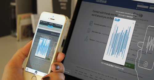
For now, it’s primarily a free WordPress add-on. Once you download the app to your smartphone, it allows you to log in to your WordPress site by waving your phone in front of your computer screen.

Clef password app

When you click “sync” on your normal login page, Clef generates a cool animated signal wave. Open Clef on your phone (there’s a PIN) and it generates a similar animated wave. Hold it up for a second, and it syncs, giving a haptic buzz when it succeeds. You can choose to stay logged in permanently, or set a time frame. Clef will log you out automatically when the time runs out.

What if you lose your phone? Clef has a remote “lockdown” key. Just let them know the phone isn’t in your possession, and they will disable Clef on the phone.

Looks like the team at Clef is expanding into payment systems and additional platforms (it works with Hootsuite and a few others right now).

The only drawback I see is that you currently have to manually open the Clef app on your phone. It would be super cool if the mobile app automatically launched when you clicked login on the desktop screen.

Give it a spin and tell me what you think! What are you currently using to help you deal with your tornado of passwords?

Author’s Bio: Rosemary O’Neill is an insightful spirit who works for social strata — a top ten company to work for on the Internet . Check out the Social Strata blog. You can find Rosemary on Google+ and on Twitter as @rhogroupee

Disclosure: I have no affiliation with Clef, and received no consideration for this post. It represents my unvarnished opinion.

Filed Under: Productivity, Successful Blog Tagged With: app, bc, security, tools, WordPress

Connected Content. Get Some.

March 4, 2014 by Rosemary

By Lisa D. Jenkins

I live in a place that’s done a lot to embrace art in every day life. When I moved to Boise, I was giddy over the artist murals that cover the downtown traffic boxes. I have a favorite. It reminds me of a Miyazaki film.

A few weeks ago, I was invited to attend a gallery opening for the colleague of a friend. There were close to a dozen pieces on display and I was immediately drawn in by the artist’s palette – all blues and reds that remind me of lined, 3 ring binder notebook paper. I’ve a decidedly odd sense of humor and as I walked from piece to piece, I felt the glimmer of a connection.

Here was a gal I could relate to. I got her sly satirical wit. I recognized something familiar in the expressions she put on canvas. Art does that.

There was one piece in particular I couldn’t get out of my mind so the next week, I went to the gallery website to have another look. Imagine my surprise when I was looking through the artist’s bio and found an image of my favorite traffic box art. Same artist – Erin Ruiz.

Fare Thee Well Erin Rulz

The two pieces couldn’t be more different but I love them both and for me the connection was cemented. I wanted to own that piece in the gallery. The artists’ body of work, her content – found in two distinctly separate spaces, did that.

You can do that.

From your blog to Pinterest and Google+, the articles you publish, the images you post and the updates you share should all work together to spark and sustain that same feeling of recognition with people who want or need what you provide.

It’s not just a picture on Instagram, a link on Twitter or a result in someone’s Google search query. Every piece of content you publish is a touchstone; a neural reminder that your product or service is an option, that your unique approach lets you serve a specific customer in a way that complements their life or business.

Turn those content touchstones to converting stepping stones when you can. While the success of this ultimately lies within your strategy and the tactics you use, there are some simple things you can do to start connecting your content today.

  • Make sure every blog post you write includes at least one link to another piece of related content you’ve published. This will pull people deeper into your site and let you share just a bit more on the subject that interests your reader.
  • Add the link to a related article to the description of images you post to social networks. When people see an image that resonates with them, the link will drive traffic back to your site – to an article that links to another article. You see what I did there.
  • Secure your Google Authorship. Right now. This connects your name and face next to your content any time it shows up in a Google search result.

One could argue these are elementary content tactics. But sometimes it’s the simple things that trip us up – or move things forward.

Is your content connected?

Author’s Bio: Lisa D. Jenkins is a Public Relations professional specializing in Social and Digital Communications for businesses. She has over a decade of experience and work most often with destination organizations or businesses in the travel and tourism industry in the Pacific Northwest. Connect with her on Google+

Filed Under: Content, Successful Blog, Writing Tagged With: bc, Writing

6 Design Principles Every Blogger Should Be Familiar With

February 28, 2014 by Rosemary

By Teddy Hunt

As a successful blogger, you’re probably acutely aware that the best bloggers are the best content creators. But even the most top-notch content needs a reliable platform to capture its readers’ attention and make it in the blogosphere. Alas, most people do in fact judge books by their cover.

Here are a few key design principles that’ll help persuade your readers to open the book and enjoy your content.

The Fundamentals

No matter what medium you’re working with, the fundamental elements of design are the same:

• Hierarchy

• Contrast

• Repetition

• Shape

• Texture

Surely there are differentiations between print and digital media, but generally speaking, these principles make up the backbone of successful design. Careful implementation of each of these principles will ensure a well-received finished product.

Hierarchy

The design principle of hierarchy refers to the order in which information is processed by viewers. When it’s implemented effectively online, viewers can quickly scan a webpage to get an idea of what content they find interesting and what content they can disregard. When the hierarchy of a website is off, it seems jumbled; users are forced to look deeper into the site to find relevant content. When viewers can’t immediately recognize what they’re looking for, they’re more likely to click away. Subsequently, this trend will hurt your SEO rankings and cut down on the overall traffic to your site.

People generally follow a top-to-bottom, left-to-right eye path when they view websites; keep this in mind as you design your webpage.

Color/Contrast

Of course, contrast is the visible difference between elements. It can refer to color, texture, shape, style, and several other factors. A healthy dose of contrast can give a website the perfect mix of variety and interest. It’s helpful for drawing attention to specific aspects of your work. It can make certain design elements pop or fade into the background, depending on how you use them. Be mindful of your use of contrast as you critique your website and avoid having too much or too little differentiation in your color scheme.

Repetition

Much like contrast, repetition can refer to a variety of elements, including shape, size, color, and texture. It adds a sense of regularity to a design, enhancing the overall flow of the page. As with any design element, too much texture can be jarring or –worse — predictable. You can utilize repetition with similarly shaped objects and fonts. The repeated designs don’t have to be identical either; sometimes illustrations with similar qualities will suffice.

Possibly one of the most versatile design principles, shape actually applies to every other principle evenly. That is, everything is a shape. When it’s applied to web design, it’s important to keep in mind the overall tone you’re striving for, creating shapes that go together with an equal balance of contrast and repetition as well.

Texture is the surface perception of shape. It can be rough, smooth, soft, hard, glossy, or matte. But it’s much more than that. When it’s used well, texture gives any design, on any platform, that “finished” look. It’s easier to describe texture in a three-dimensional design: the feel of a canvas through paint thickness or the surface of a sculpture through carving techniques.

In visual designs, such as websites, texture is suggested and not felt.

Web designers can achieve visual textures through simulating the visible attributes of real-life textures by implementing shading and shadows, as well as mimicking the coloring of real objects. Often it’s achieved through the repetition of lines, marks, and strategically placed spacing. Bring texture into your website’s design and you’ll up the “wow” factor instrumentally.

As you can see, there’s a very thin veil between web design and traditional design. While certain key changes have to be made to accommodate digital platforms, everything that’s important for traditional designers is also key for web designers. Every blogger should be aware of these principles and use them on their sites.

Do you have any tips or tricks for using these design principles on your blog? Please feel free to share with us in the comments.

Author’s Bio: Teddy Hunt is a freelance content writer with a focus on technology. When not behind a computer, Teddy spends the majority of his free time outdoors and resides in Tampa, Florida.

Filed Under: Design Basics Tagged With: bc, Design

Untangling Marketing Goals, Strategies, and Tactics

February 27, 2014 by Rosemary

Today, I have a confession.

I’m a serial hobbyist poser.

I have whole closets full of squash rackets, glue guns, guitar music, and other must-have items that I bought before figuring out what I really wanted to spend time doing. I’d see a Martha Stewart article about paper quilling and run out immediately to buy specialized tools.

Do you find yourself with all of the “trappings” of marketing, but no results to show for it? I’m talking about that time you signed up for a Google Analytics account and then never looked at any of the data. Or that time you started a monthly email newsletter and it only went out for three months.

Without a clear marketing plan, you will run from idea to idea, or tool to tool, with no roadmap. Even if you have success, you won’t know how it happened, or be able to repeat it in the future.

Your marketing plan must dovetail with your overall mission as a business. Untangling those priorities and putting them in the correct order is crucial to your business success.

untangled marketing

Start with the Mission, Work your Way Down

So what comes first? It’s your Mission. Why does your business exist? Not a prefab paragraph you concocted, but why you get up in the morning and go to work.

Once you know your Mission, you can use that to come up with some marketing goals. Once you have marketing goals, you can determine your marketing strategy and tactics. Somewhere within your arsenal of marketing tactics, you can include some social media tactics.

See how that worked? We zoomed in several levels before we got to anything like “make a Facebook page” or “create a Vine video.”

Sorting out Goals, Strategies, & Tactics – An Example

Let’s use a concrete example that will help clarify. I like to use the American Red Cross, because hey, they help people!

Their stated Mission is “The American Red Cross prevents and alleviates human suffering in the face of emergencies by mobilizing the power of volunteers and the generosity of donors.”

Here’s my sample made-up marketing goal for the American Red Cross:
“Promote 100 blood drives in the State of South Carolina in Q1 of 2014.”

How can we achieve that goal? We need a strategy (or a few strategies).

For example:
Strategy 1: Increase sharing mechanisms for current donors.
Strategy 2: Create content that demonstrates the value of blood drives.
Strategy 3: Build up number of donors who subscribe to text reminders.

You could use all sorts of tactics to support these strategies. They might run the gamut from buying billboard space next to a donation center, to collecting Twitter handles during the donor registration process. They can be traditional tactics, or they can involve social media.

Let’s break out some potential tactics for Strategy 1, to illustrate:

Tactic 1: Collect Twitter handles during the donor registration process.
Tactic 2: Invite current donors to participate in phone banks to encourage new donors.
Tactic 3: Set up a video sharing station at blood centers to facilitate Vines, Instagrams after donation.
Tactic 4: Offer an “I donated” button for social profiles.
Tactic 5: Give out Red Cross t-shirts or other branded materials to donors.

The final step is to analyze the possible tactics according to your own criteria for success. What resources would be required? How much time would it take? What is the cost? Does it fit in with the rest of our marketing program?

Once you’ve decided which tactics suit your situation, create a calendar and plot out the marketing program. Be sure to build in periodic reviews, so that you can adjust as necessary.

Going through a process like this will result in a marketing strategy and business plan that make sense for your business. It will prevent shiny object syndrome. And it will leverage your marketing investment in a dramatic way.

Author’s Bio: Rosemary O’Neill is an insightful spirit who works for social strata — a top ten company to work for on the Internet . Check out the Social Strata blog. You can find Rosemary on Google+ and on Twitter as @rhogroupee

Filed Under: Marketing, Successful Blog Tagged With: bc, marketing plans

  • « Previous Page
  • 1
  • …
  • 37
  • 38
  • 39
  • 40
  • 41
  • …
  • 84
  • Next Page »

Recently Updated Posts

Is Your Brand Fan Friendly?

How to Improve Your Freelancing Productivity

How to Leverage Live Streaming for Content Marketing

10 Key Customer Experience Design Factors to Consider

How to Use a Lead Generation Item on Facebook

How to Become a Better Storyteller


From Liz Strauss & GeniusShared Press

  • What IS an SOB?!
  • SOB A-Z Directory
  • Letting Liz Be

© 2025 ME Strauss & GeniusShared